We of T
Overview
We partnered with the University of Toronto Innovation Hub to develop a digital solution for fostering connectedness. Our final product, We of T, is a platform for building community among U of T students who need it the most. With curated friend suggestions based on academic and personal elements, We of T aims to transform U of T’s campus to a more welcoming place.
I administered surveys and interviews and was the evaluator for most of our usability sessions. While our time with this project has come to an end, the Innovation Hub was receptive to our branding and concept, potentially applying it in future projects on Fostering Connectedness.
work UX Designer, Project Manager
date_range 12 weeks
groups Jie Guo, Kai Hong, & Jing (Chris) Xie
construction Figma, Google Suite, Miro, Xtensio
Deliverables keyboard_arrow_down
I. User Research
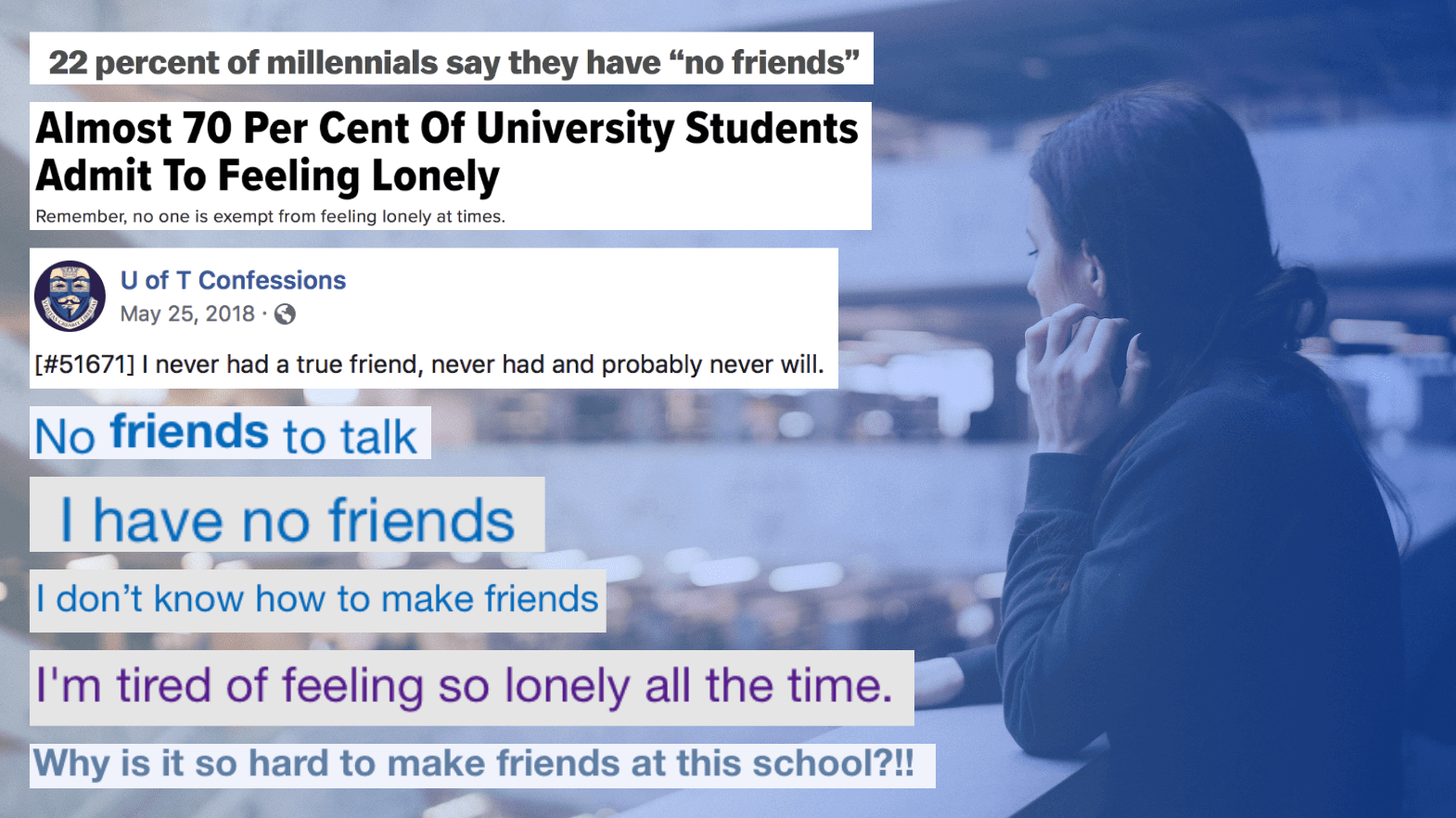
My goal was to identify underlying causes of the University of Toronto's lack of community and how it could be mitigated through the digital space. We collected secondary research from the Innovation Hub, social media platforms, and academic journals and conducted user interviews and surveys to discover a disturbing lack of community and trend of loneliness at the university.
“I spend nights talking to myself because there’s no one to talk to or confide in.”
Meeting people is relatively easy, but making genuine connections that last beyond a semester is much more difficult. From our research, we found that this problem was driven by three main factors.
- How can we alleviate social anxiety and help people break the ice?
- How can we overcome the campus culture of academic competitiveness to reach the large commuter population?
- How can we help people find time to socialize with familiar faces?
II. User Analysis

Meet Sammie, the Socialization Seeker.
Sammie is trying to survive her second year of life science, but it’s difficult when the last time she had an actual conversation was a week ago (and that was just with the Starbucks barista!). The people she met at orientation have all but disappeared and her family is across the ocean blue. Online forums advise her to join clubs and attend events, but that doesn’t help much when her anxiety kicks in.
As we empathized with Sammie and reflected on our research, we defined her needs and pain points as she silently struggled in a sea of faces.
Thinking About Sammie
We brainstormed together as a team to create Sammie, drawing from our research findings.
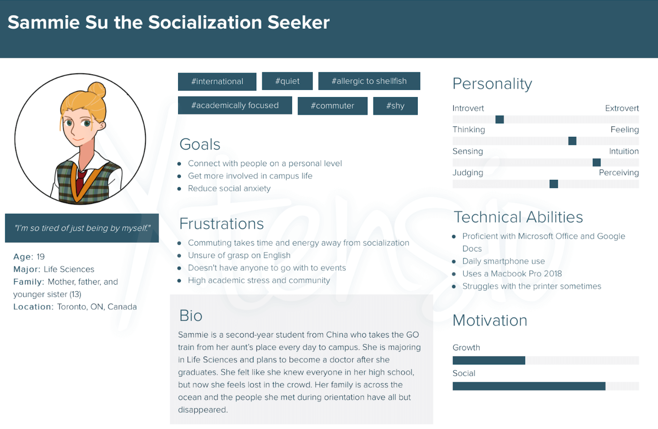
Meet Sammie.
A second-year life-sci major just trying her best to fit in. This persona was created to help the team empathize with Sammie. Made with Xtensio.
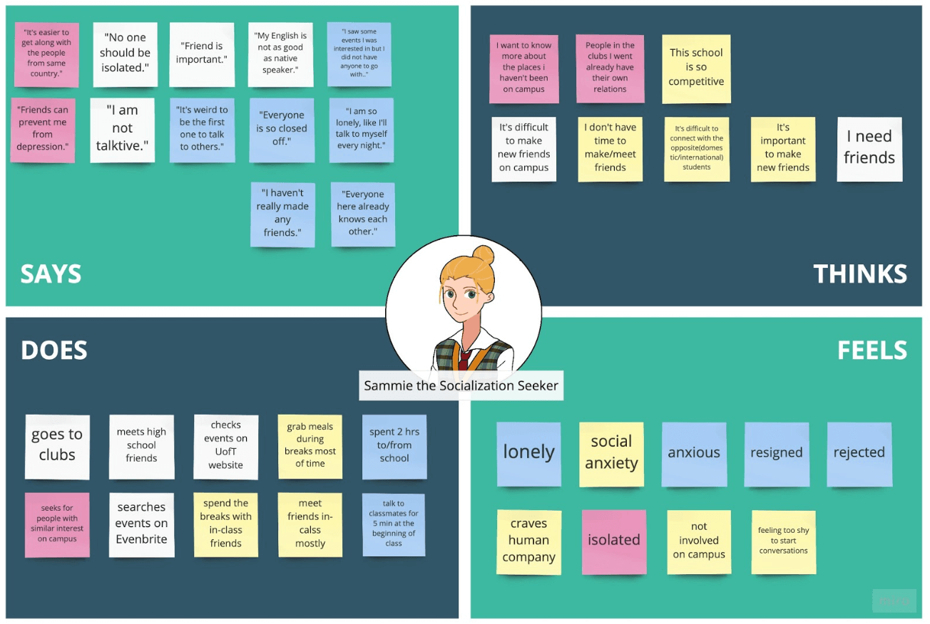
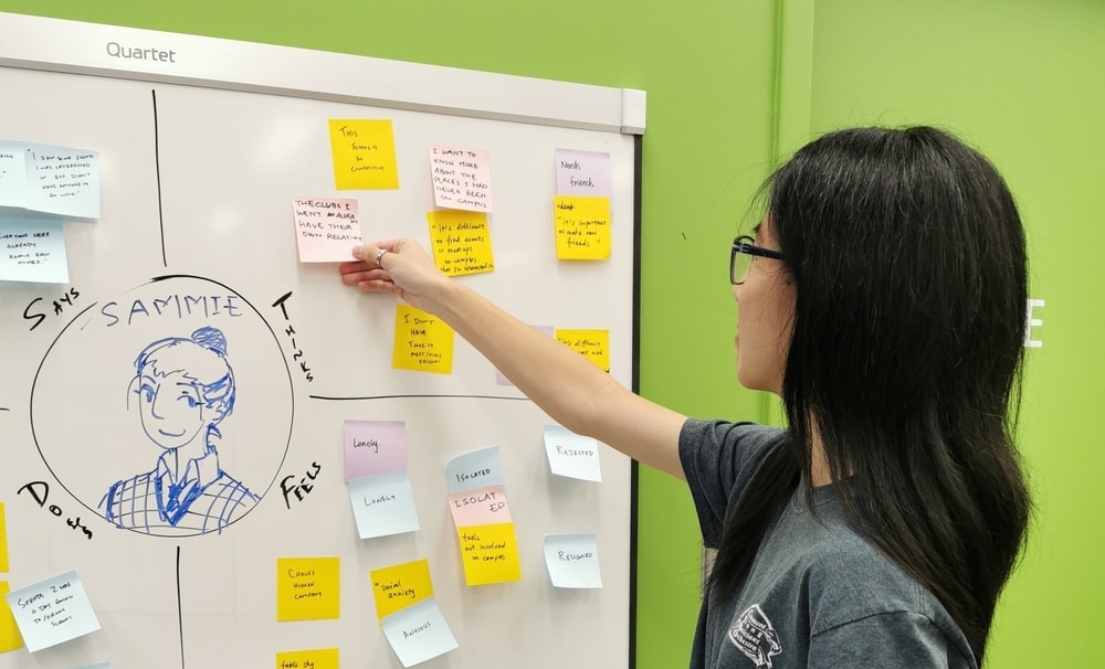
Empathy Mapping
We created an empathy map to illustrate what Sammie says, thinks, does, and feels. Made with Miro.
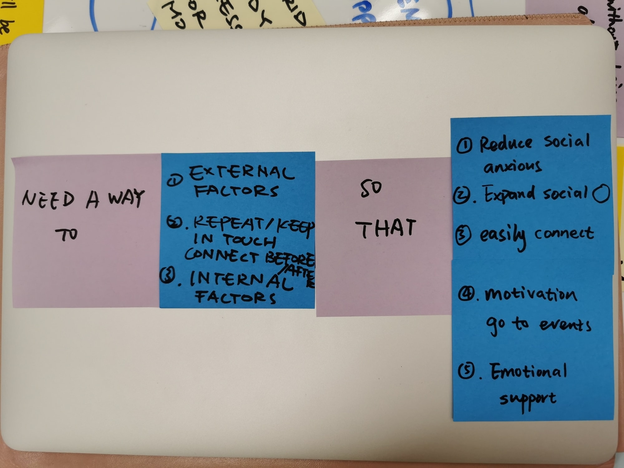
Sammie's Needs II
A basic outline of Sammie’s needs.
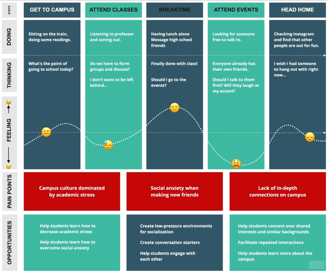
As-Is: Sammie's Journey
We journey-mapped Sammie’s as-is scenario to discover the high points and areas of opportunity to target. Made in Miro.
III. Requirements Analysis
Now that we had a better understanding of the problem and Sammie’s needs, it was time to start generating “big ideas” to help Sammie out. Out of 18 total ideas, we converged on three:
- Small and temporary groups for local events and activities
- Dynamic event recommendations based on an extremely localized radius
- Potential friend and activity suggestions during free periods of time
With We of T, Sammie could easily start coming out of her shell with others in the same boat, all without neglecting her academics. As a team, we established three hills, design statements to unify the team and establish the goals of the project.
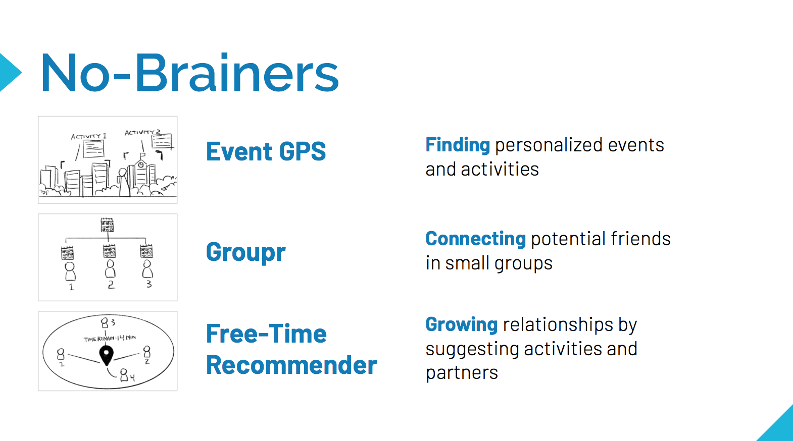
"No-Brainer" Big Ideas
As we finalized our three ideas, we kept building on the “Find, Connect, Grow” theme. Sketches by Kai Hong.
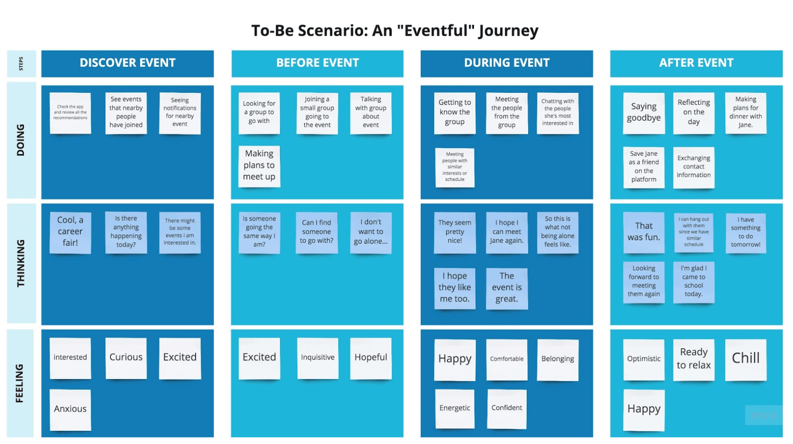
To-Be: An "Eventful" Journey
Sammie knows the career fair is going on today, but doesn’t really want to go alone. With We of T, she easily connects with other attendees and is a smashing success with recruiters. Made with Miro.
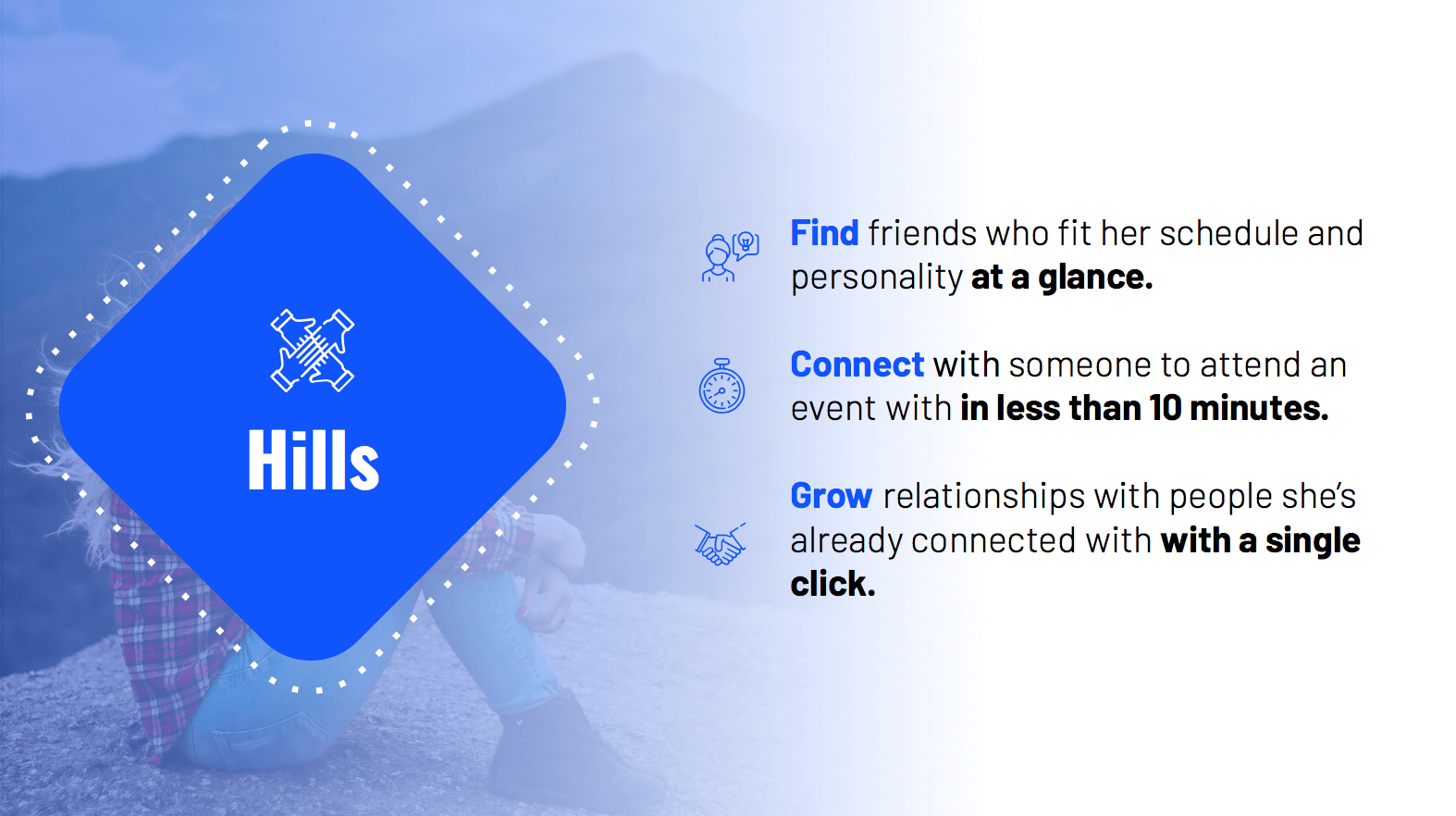
Hills
These hills made sure everyone was on the same page and reaching for the same goals, as well as more concretely outlining the features we would implement.
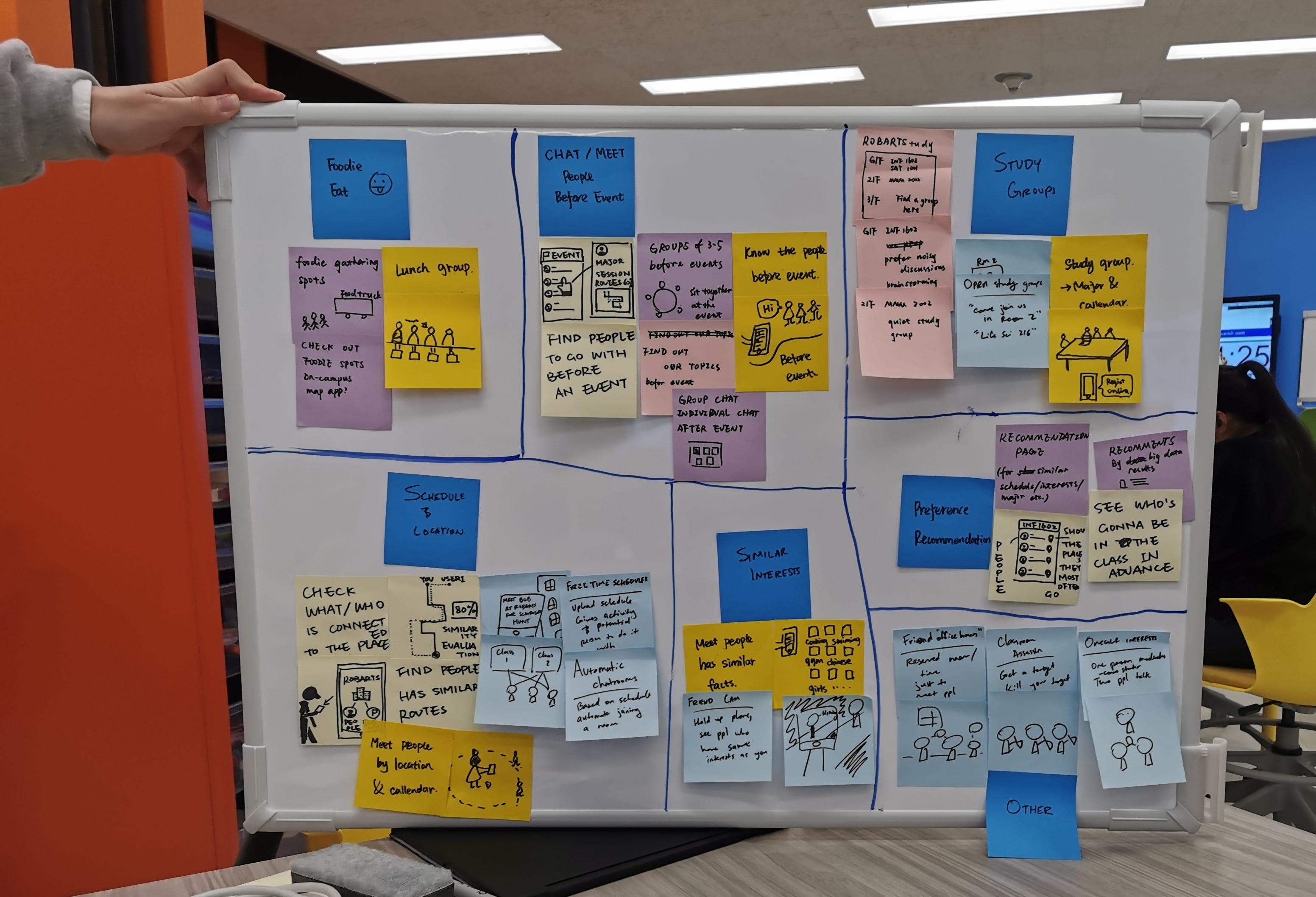
Brainstorming Big Ideas
We ideated and affinity-diagrammed “big” ideas (and a few absurd ones!) as a team.
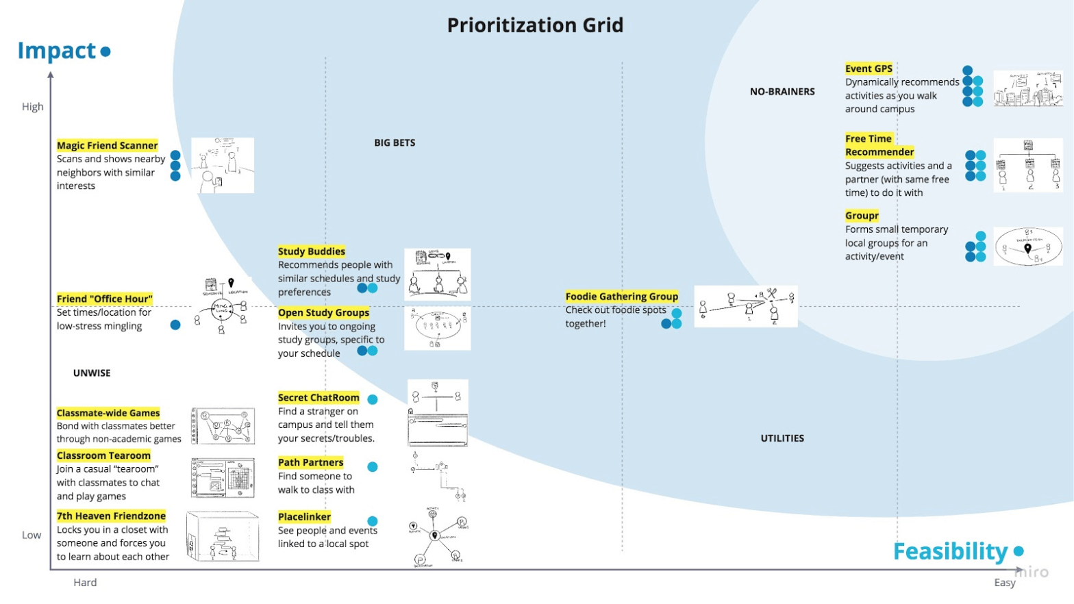
Prioritization Grid
To narrow down our list of ideas, we ranked them on impact and feasibility, ending up with the three no-brainers. Made in Miro.
IV. Prototypes
After creating and guerilla-testing our paper prototype, we used that feedback to inform changes for our mid-fidelity prototype. Our design focused on three main stages: finding friends, connecting through meet-ups, and growing relationships afterwards.
Low-Fidelity
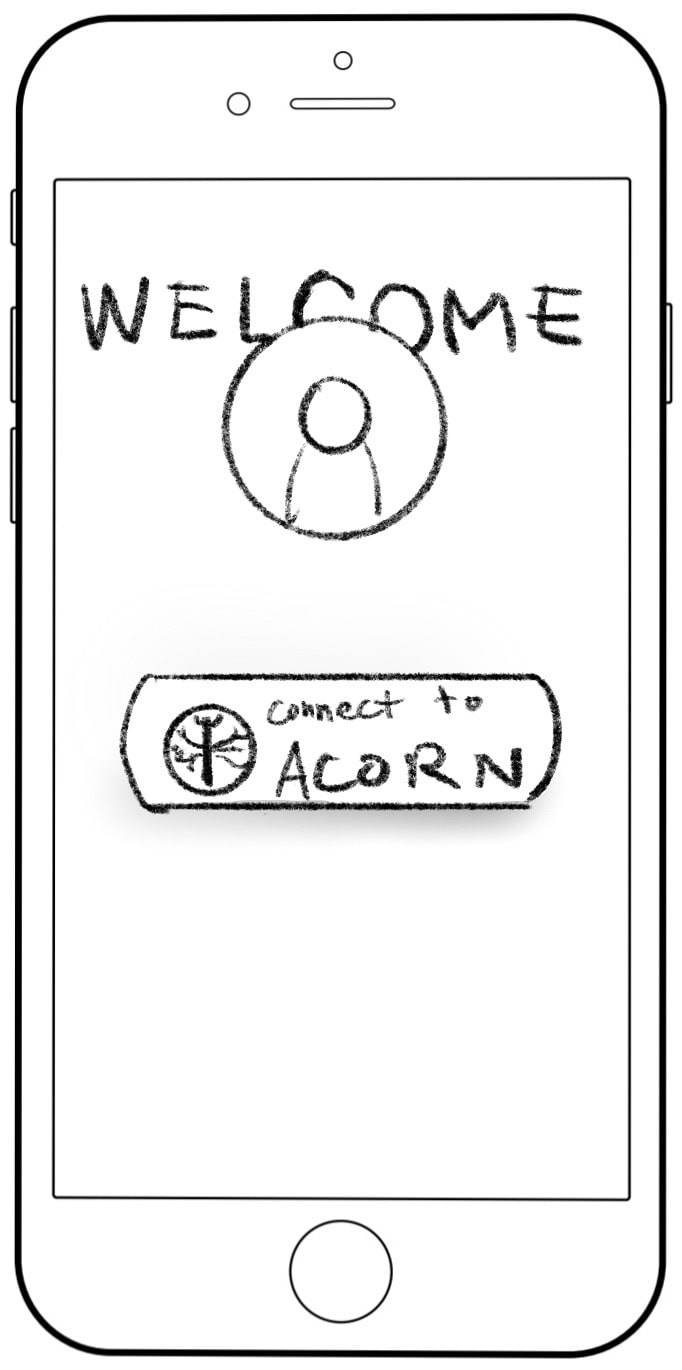
1. Login
Integrated with the school system to collect class information.
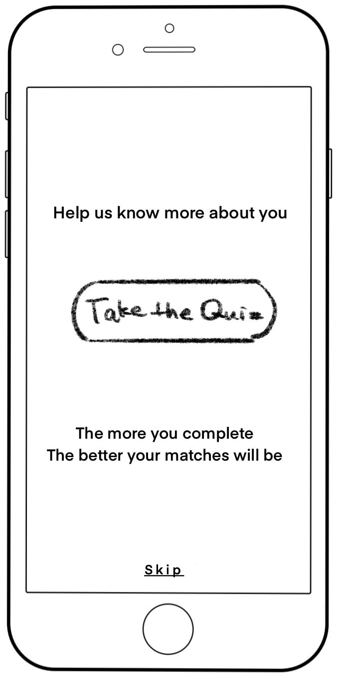
2. Quiz Introduction
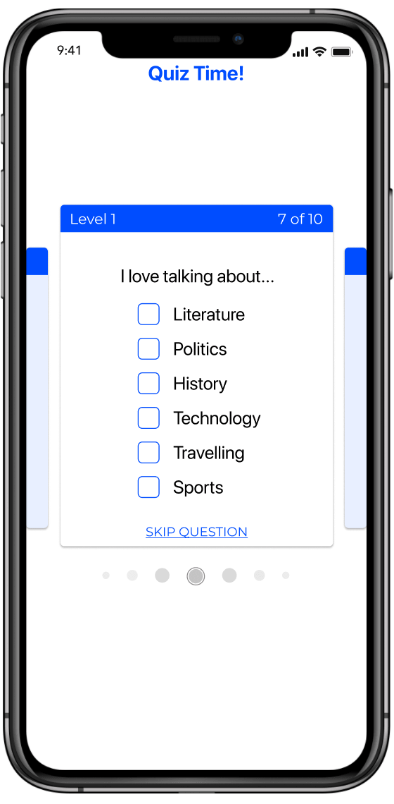
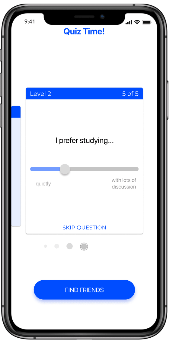
Questions based on values, interests, and preferences.
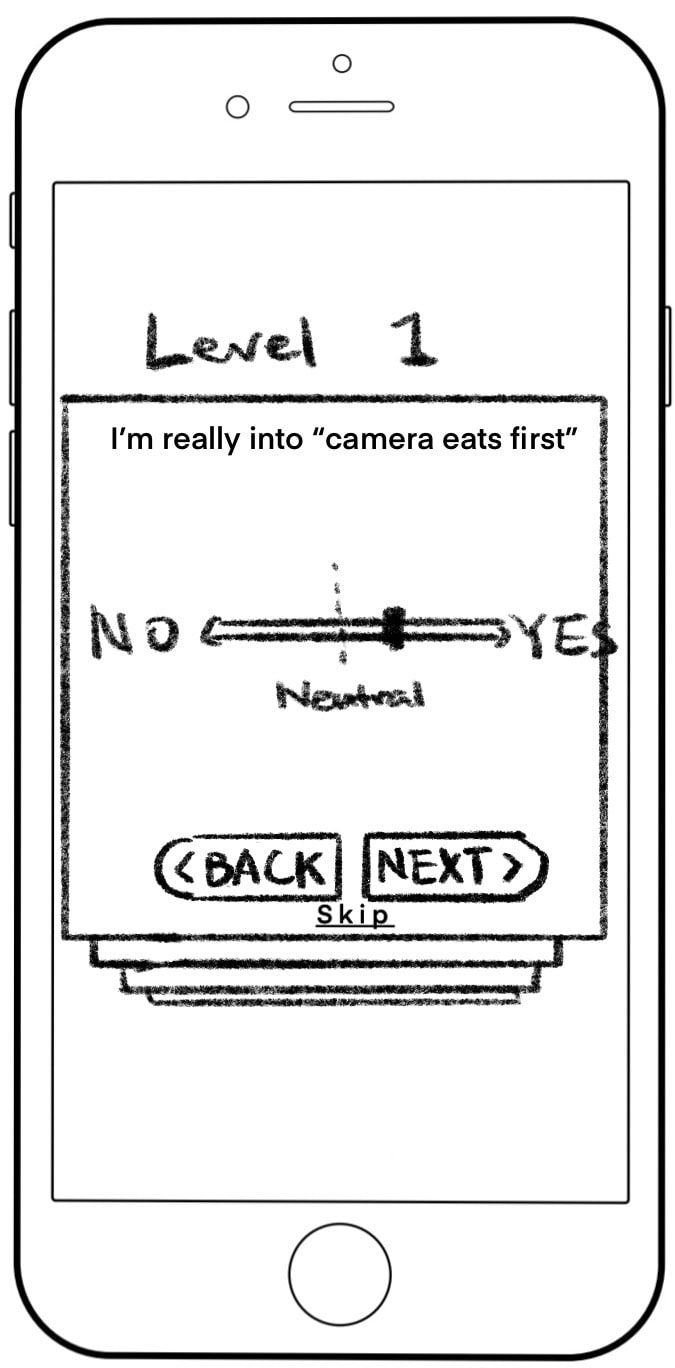
2a. Quiz Question
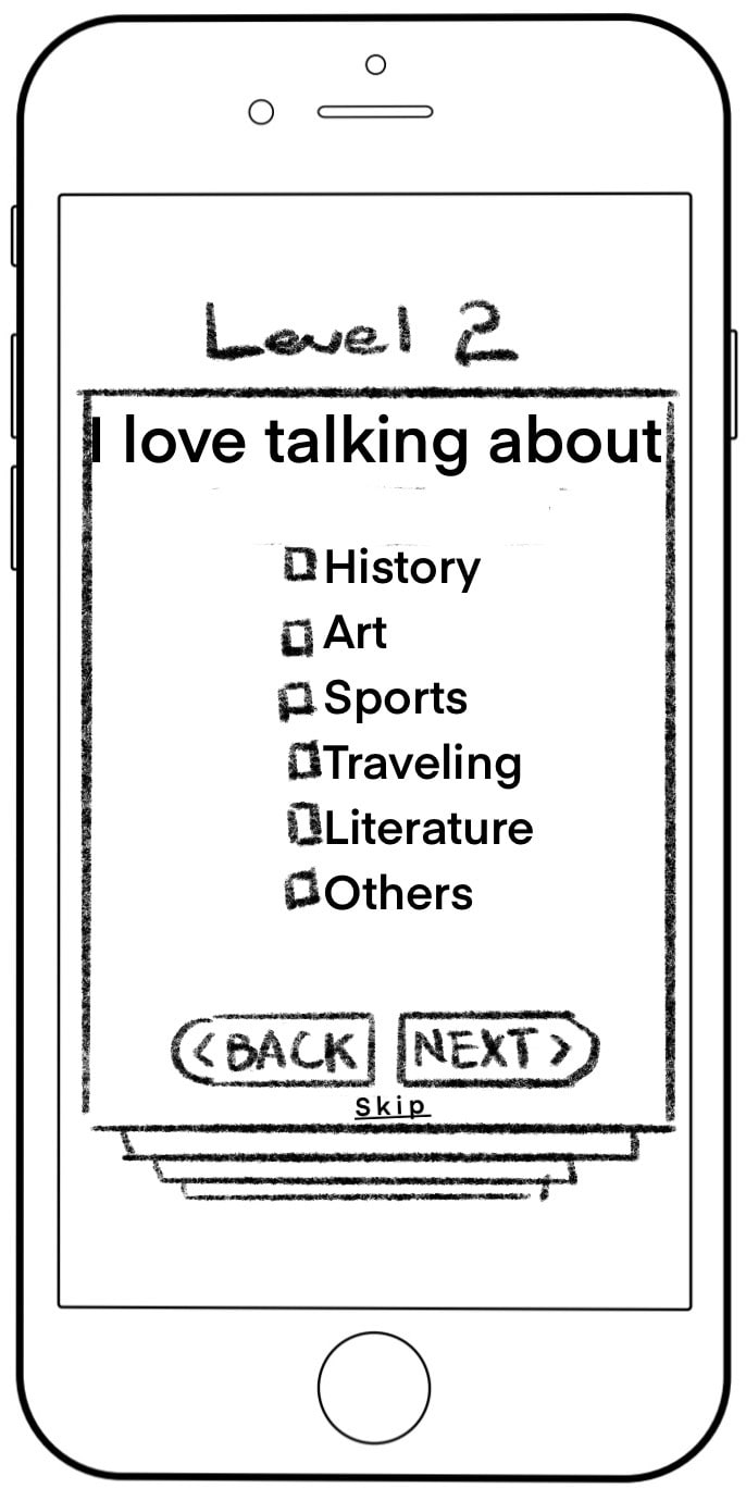
2b. Quiz Question
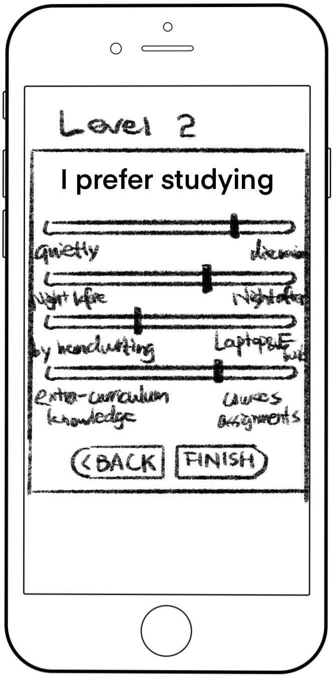
2c. Quiz Question
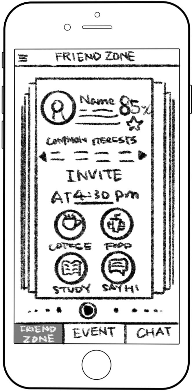
3. Friends
Originally “Friend Zone”. Potential friend matches (capped per week) show things in common and open invites.
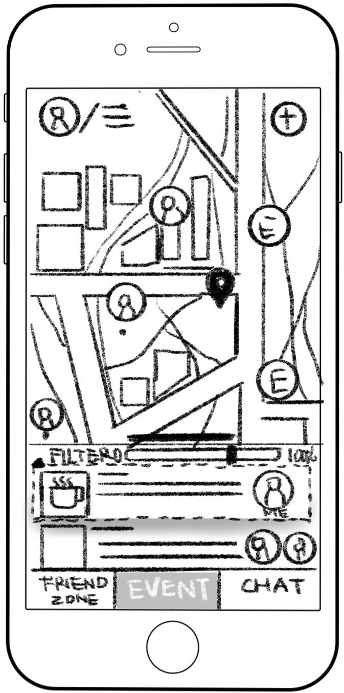
4. Events
Map and list view together, with a similarity filter and event details
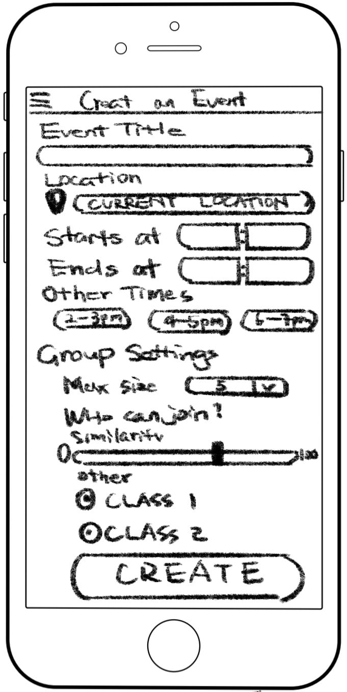
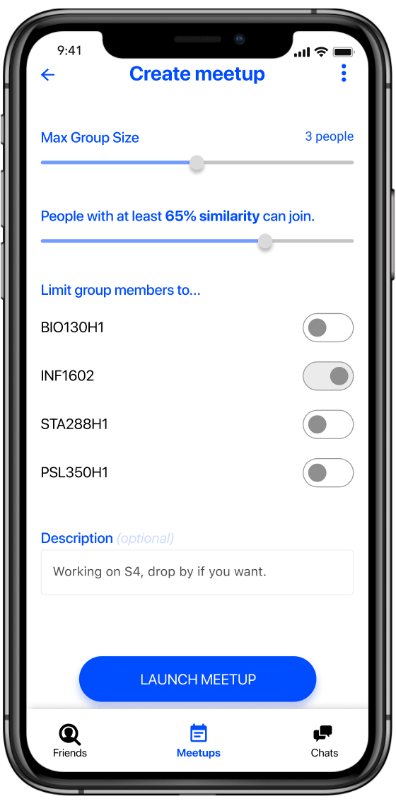
5. Creating an Event
Event details with group size limitation and filters for classes and similarity.
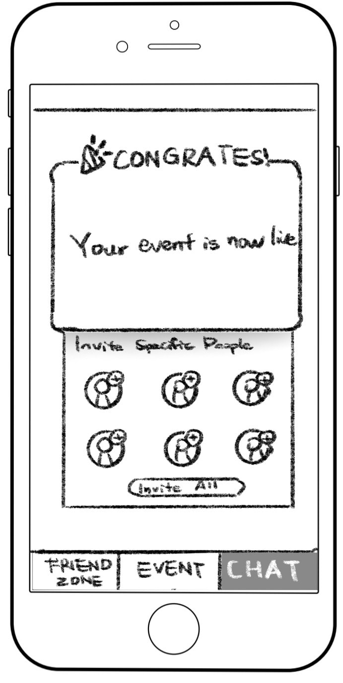
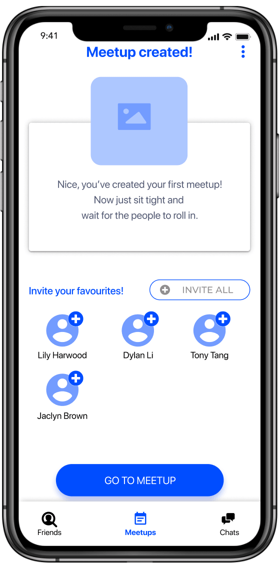
5a. Event Created
Invite specific people or just wait for them to roll in.
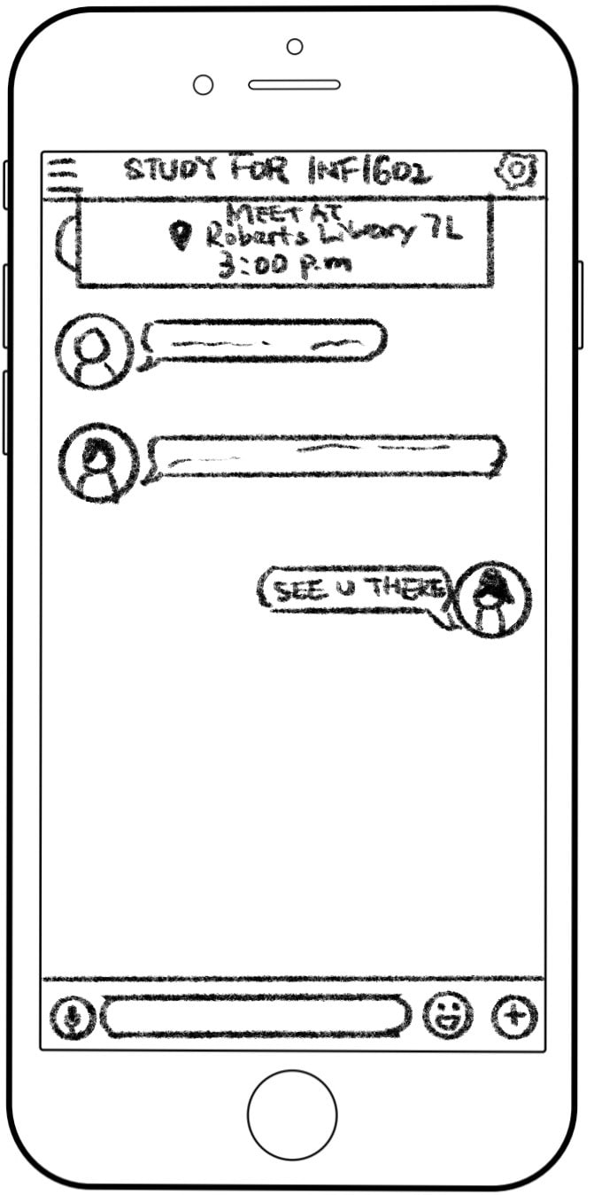
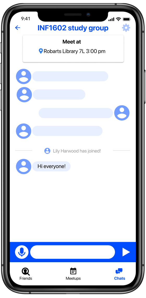
6. Chat
Meet-up details and getting to know one another.
Mid-Fidelity
We created our mid-fidelity prototype (Figma, iPhone 11) with mostly the same flow as our paper prototype. From our feedback, we included more internal explanations of how the app worked, clarified some terminology, and separated the events page into two distinct views.
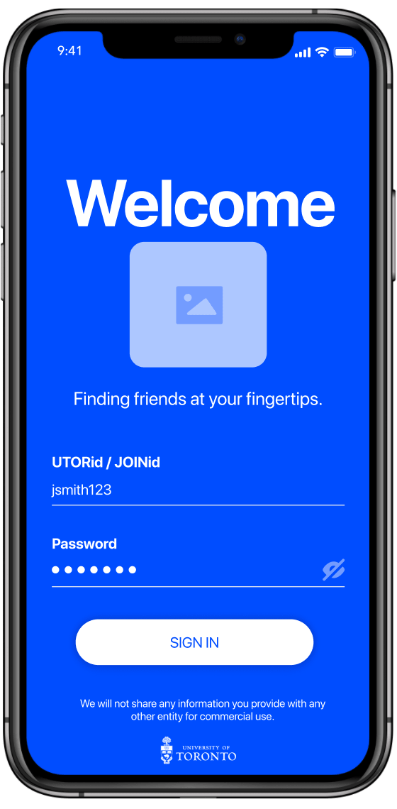
1. Login
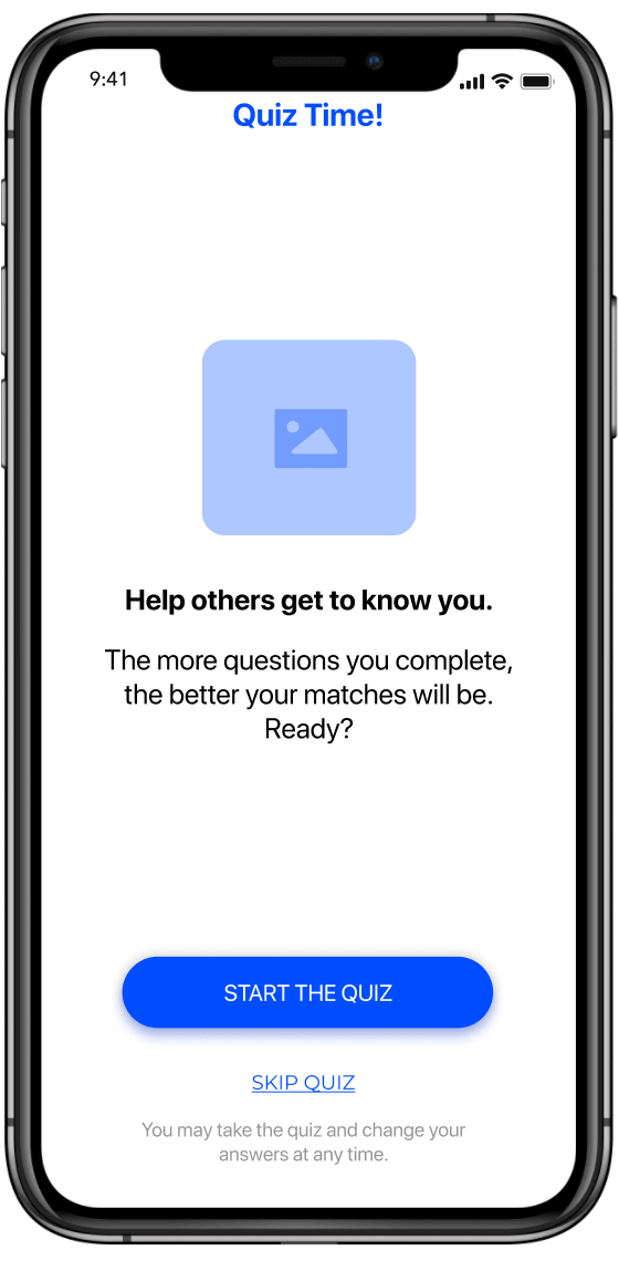
2. Quiz Introduction
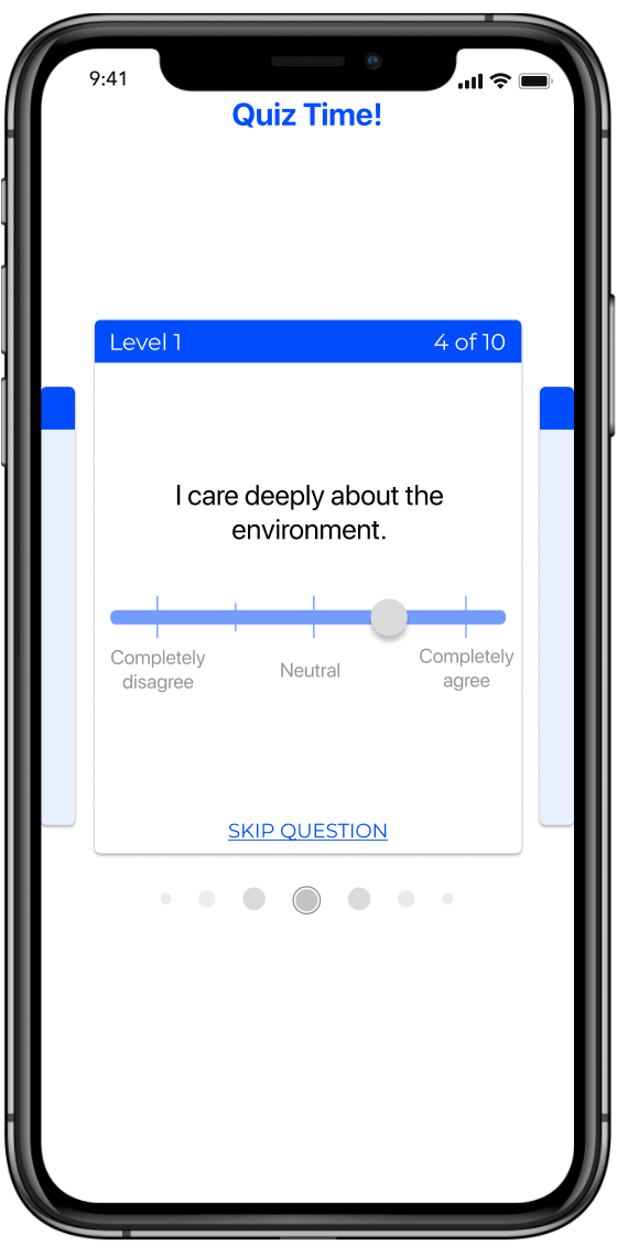
2a. Quiz Question
2b. Quiz Question
2c. Quiz Question
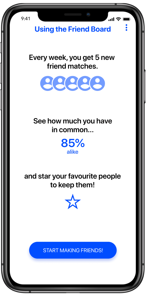
3. Friends Board
Introduction screen.
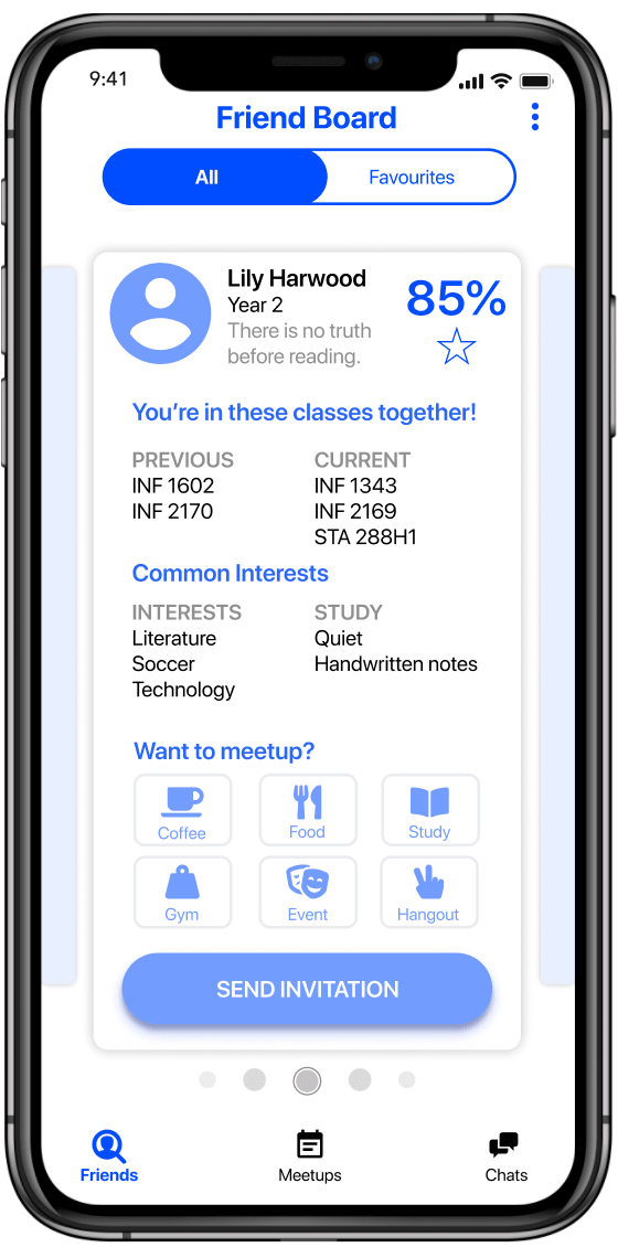
3a. Friend Board - All
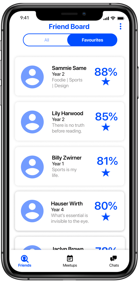
3b. Friend Board - Favourites
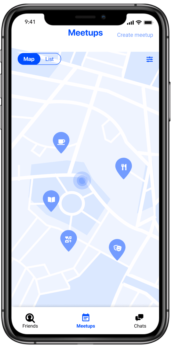
4a. Events - Map View
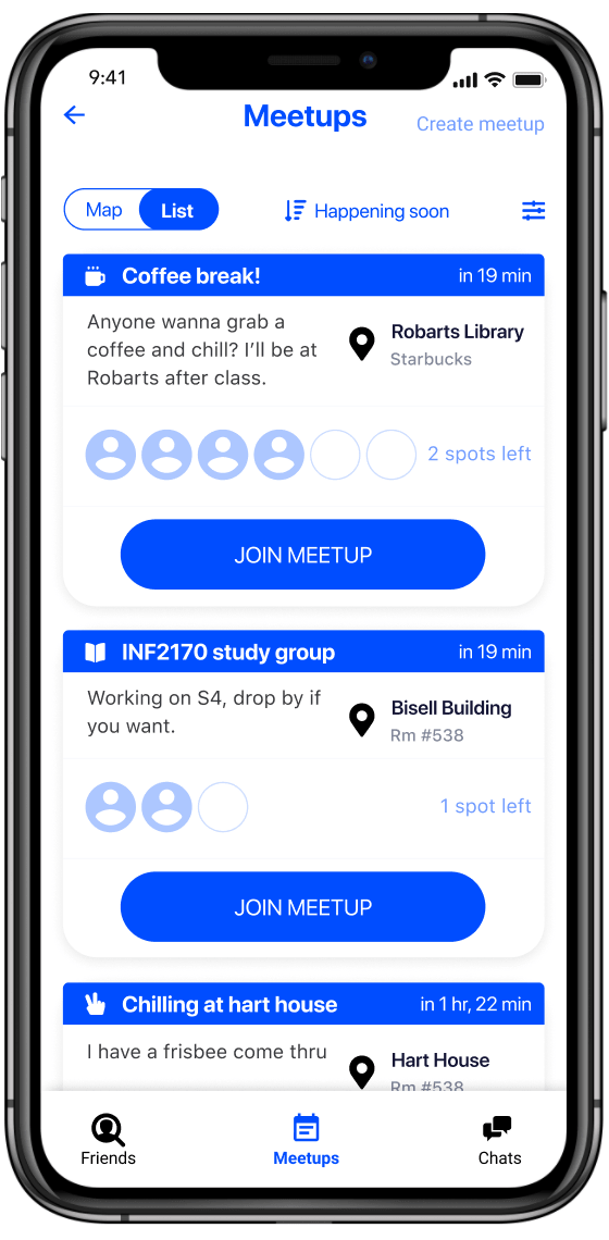
4b. Events - List
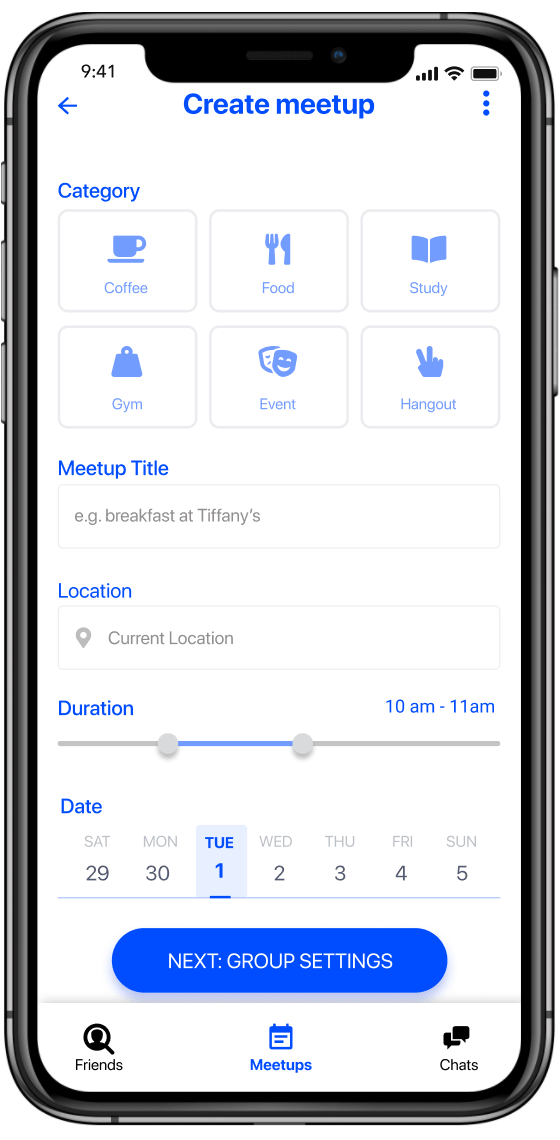
5a. Create Meetup
5b. Create Meetup - Group Settings
5c. Create Meetup
6. Meetup Chat
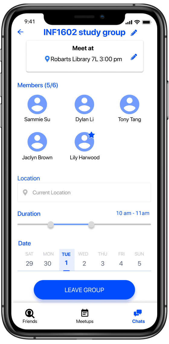
6a. Meetup Chat - Settings
V. Evaluation
We conducted one last round of heuristic evaluation and comprehensive usability testing on our mid-fidelity prototype to validate our design, ideas, and assumptions. While we weren’t as successful as we had hoped, there were clear indications that we were definitely on the right track.
Heuristic Evaluation
Before embarking on our usability testing, we wanted to get the green-light for our prototype. Feedback from three experts let us fix up some last-minute glaring usability issues, and we were ready to go.
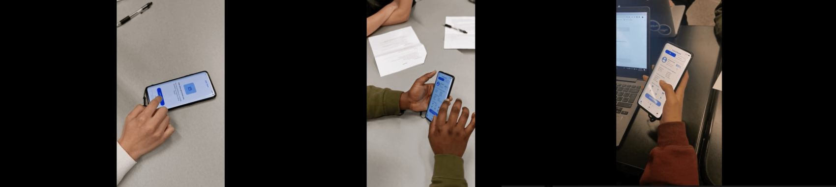
Usability Testing
Participants were asked to carry out three tasks centred around our continuous theme of “Find, Connect, Grow” while the team observed and took notes. After testing, we conducted semi-structured interviews and used the System Usability Scale (SUS) to qualitatively and quantitatively gauge the success of our design.
Results
Participants liked and understood the purpose of the app! Participants were able to capture the concept succinctly -- fighting loneliness, casual meet-ups, and finding friends based on academics and interests -- without any prior knowledge.
The UI wasn’t…great. With a SUS score of 65 and some key UI elements playing Where’s Waldo?, participants were understandably frustrated.
Barriers to usage. Some users felt uncomfortable with the idea of going to events with a stranger, though they liked connecting through academics.
We summed up our concept through a video showcasing Sammie and how We of T would change her life.
Voiced by Grace Chen. Sketches by Kai Hong. Video editing by Jie Guo and Jing (Chris) Xie.
VI. Next Steps & Takeaways
- Refining the onboarding process. Users need to really trust that the system is matching them with people they’d like to meet in real life. We neglected to include a profile page for the user themselves, which was mentioned by several testers.
- Overhauling the Meet-ups page. Though we improved it a bit from our paper prototype, users still failed to find key elements at times. However, once a user started on the right path, they found the process of creating and joining meet-ups quite easy and intuitive.
User interviews, questionnaire design, affinity diagramming, usability testing, heuristic evaluation are all now a solid part of my toolkit, but one essential thing I learned was knowing the right time to use which tool. More importantly, I learned to build my empathy and storytelling through constant, iterative feedback, something that will serve me well as I continue on my path in the UX field.