Margin & Options Application
Overview
As a UX Designer (later UX Researcher) at CIBC Investor's Edge, I led the end-to-end design and research process for the Margin & Options Application, a form that lets users set trading permissions for their investment accounts.
I explored a variety of design patterns and pushed the technical capabilities of our development team, ultimately establishing standards for future forms on CIBC Investor's Edge and delivering a cohesive and satisfying user experience that supported business needs.
work UX Designer, UX Researcher
date_range Dec 2021 - Oct 2023
groups Roger Heale, Niyati Behl, & Deborah Chan
construction Figma, Microsoft Office, UserTesting.com
stat_minus_2 Deliverables stat_minus_2
I. Background
CIBC Investor's Edge is an online brokerage serving investors who prefer to handle their finances themselves, taking commissions for every completed trade. The Margin & Options Application was part of a larger business initiative to (a) reduce paperwork and manual labour, and (b) promote options trading activity to increase revenue.
Margin and options trading
Here's a quick rundown of investing terms you might see in this case study:
- Margin account: In this type of account, the brokerage lets the investor borrow cash, using their own assets as collateral. An investor can buy more than they normally could but may also lose more (higher risk).
- Options: A high-risk investment that lets you buy or sell a stock at a set price in the future. More complex strategies are riskier and need special approval.
Due to the riskier nature of options, investors must first be approved by their brokerage before they start trading. They're typically evaluated on their investment objectives, trading experience, financial situation, and level of options trading they wish to apply for.
II. Understanding the problem
I gathered requirements from key stakeholders (i.e. product owner, legal, business process, development, etc.) to figure out the constraints I was working with. The project scope was twofold:
important_devices Webform
Design an online form that collects all details relevant to the margin & options trading approval process.
contract_edit Standalone form
Create a new paper form with only the related parts from the Investor's Edge account application.
This project was particularly challenging due to the complex nature of options trading and financial industry regulations. To familiarize myself with the basics, I dove into a variety of learning material, consulted subject matter experts on the team, and conducted a competitor analysis before even lifting a pencil.
From there, I identified two key user needs:
- How can we help users determine what level of options trading is most suitable for them?
- How can we help users complete a long form without overwhelming them with information?
III. The design
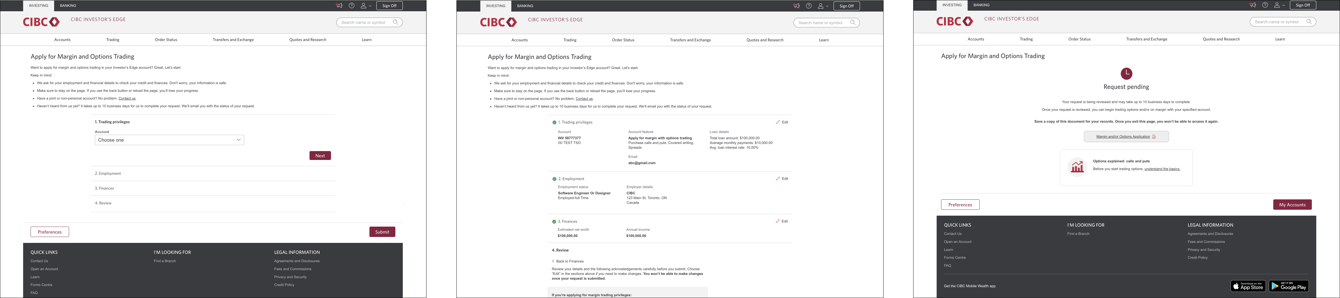
There were five pieces of information we needed to collect from users: (a) trading preferences, (b) employment status, (c) financial details, (d) trading disclosures, and (e) legal agreements.
Navigation
Since this was a much more exhaustive form than had previously existed on our platform, I conducted secondary research to better understand existing design patterns for long forms. After considering the content and context we needed to support, I came up with three navigational approaches.
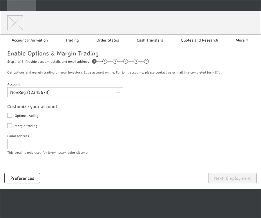
Stepper
Our existing forms pattern. Straightforward and simple with top-level stepper.
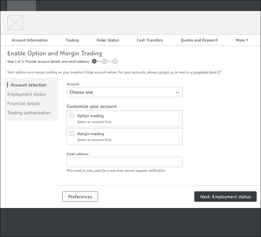
Sidebar
A floating sidebar with section titles, based on our account application process.
Accordions
Rows of collapsible sections.
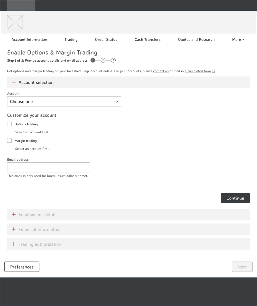
Each approach had different strengths with visiblity of content and information overload. However, at its core, navigation is all about helping users know where they are, what they've already done, and where they can go. Based on this criteria, we decided to test our strongest contender, the accordions.
This approach built on pre-existing mental models of shopping cart checkouts with strong navigational landmarks, making it more familiar for users. It also gave us enough space to place summaries of user-entered details and easy switching between sections.
Flow
Since the margin & options approval was already part of the account application process, I pulled existing components for the employment and financial information sections to reduce design and development effort.
Figuring out the trading preferences selection was trickier. There were several legacy dependencies and regulatory rules we had to follow, as well as supporting users with differing levels of options expertise. I followed the principle of progressive disclosure to reduce the cognitive effort upfront and make the overall form easier to complete.
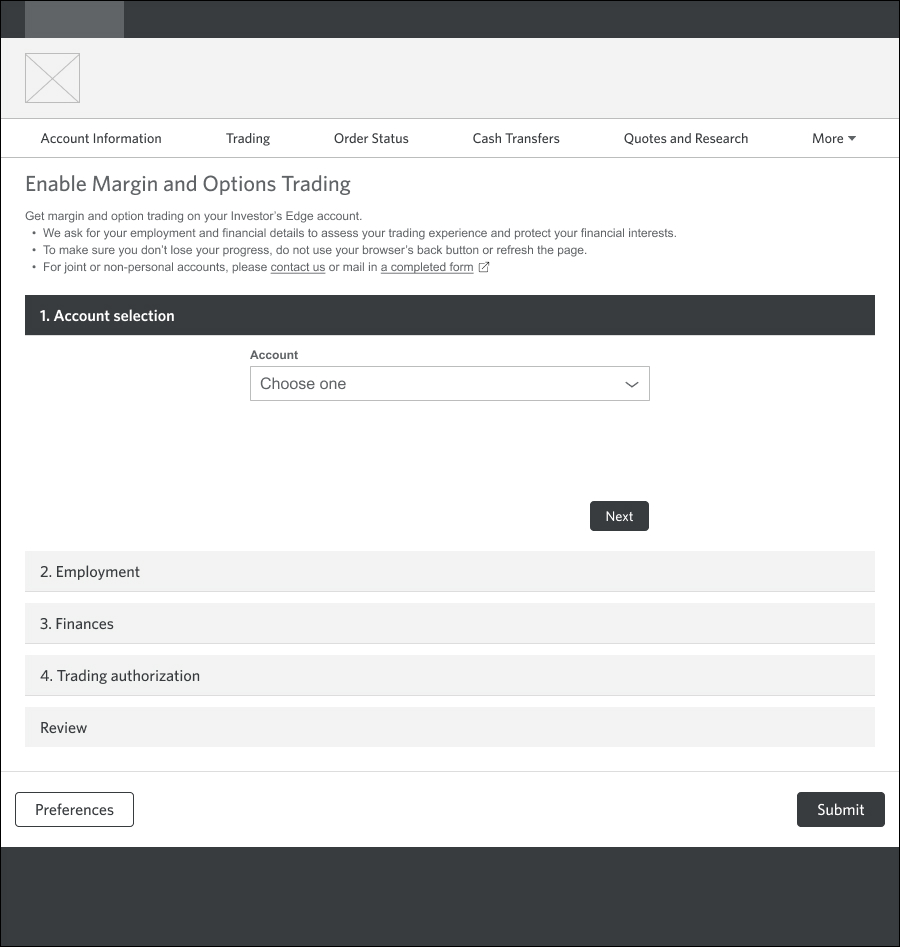
(a) Trading Privileges
To minimize information overload, we presented just one action at the start: selecting the investment account they wanted trading privileges for.
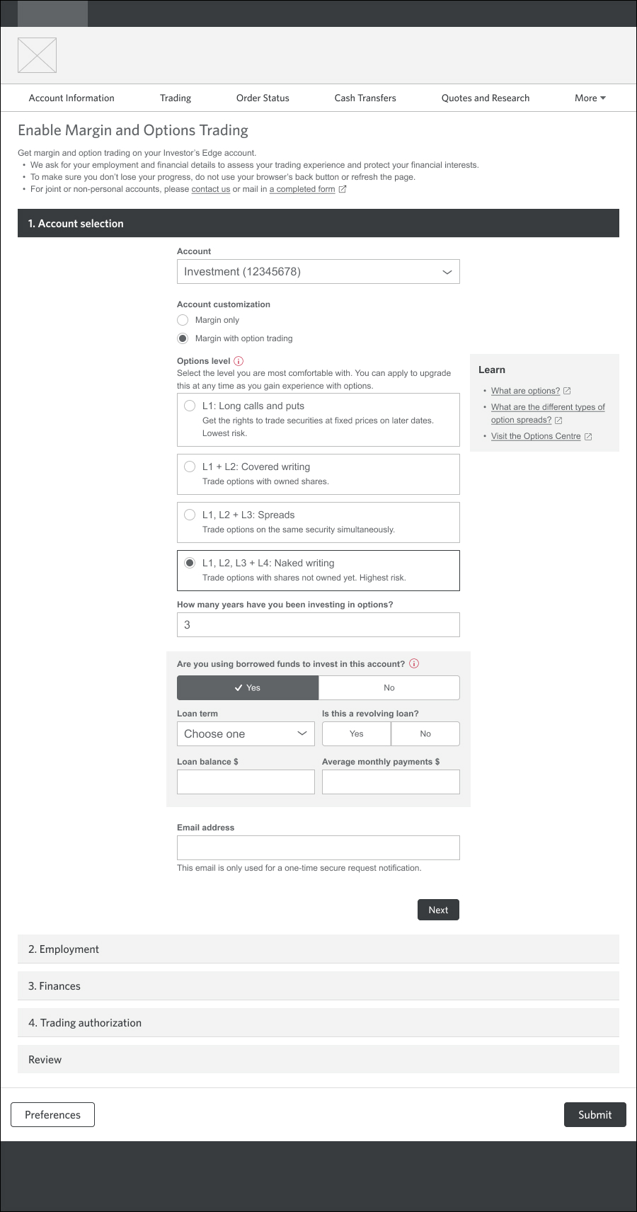
(a) Trading Privileges (filled)
A lot of content and a lot of logic, managed with more progressive disclosure.
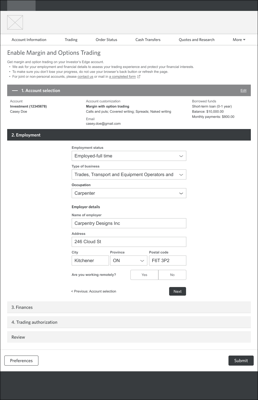
(b) Employment
Trading privileges collapsed and summarized.
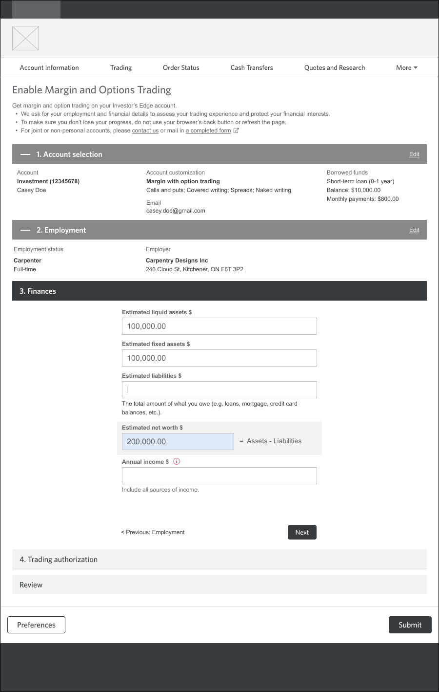
(c) Finances
Dynamic hint text and auto-calculation of totals.
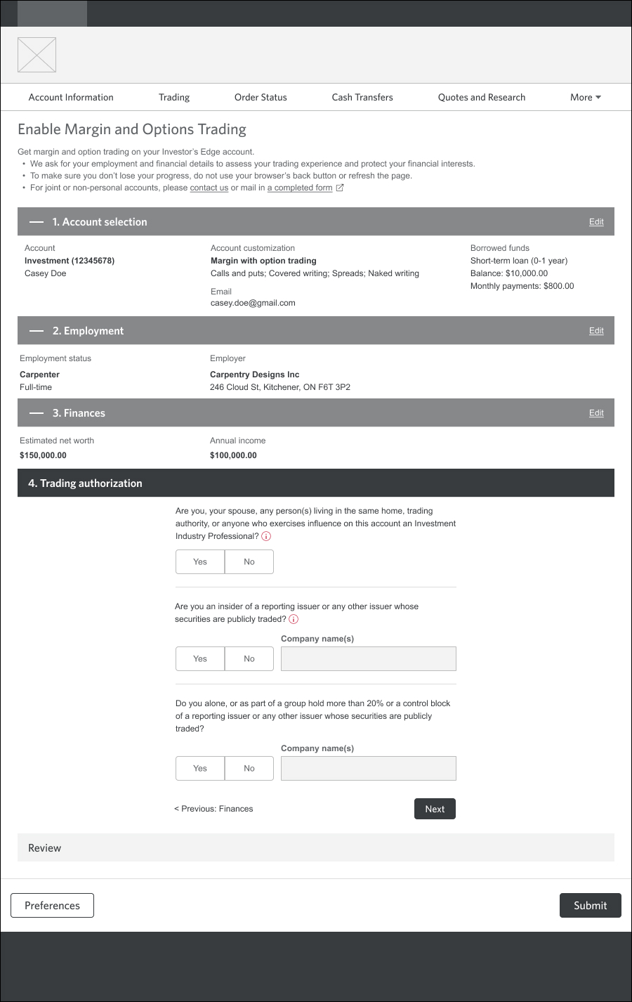
(d) Trading disclosures
Yes/No questions that were tricky to parse.
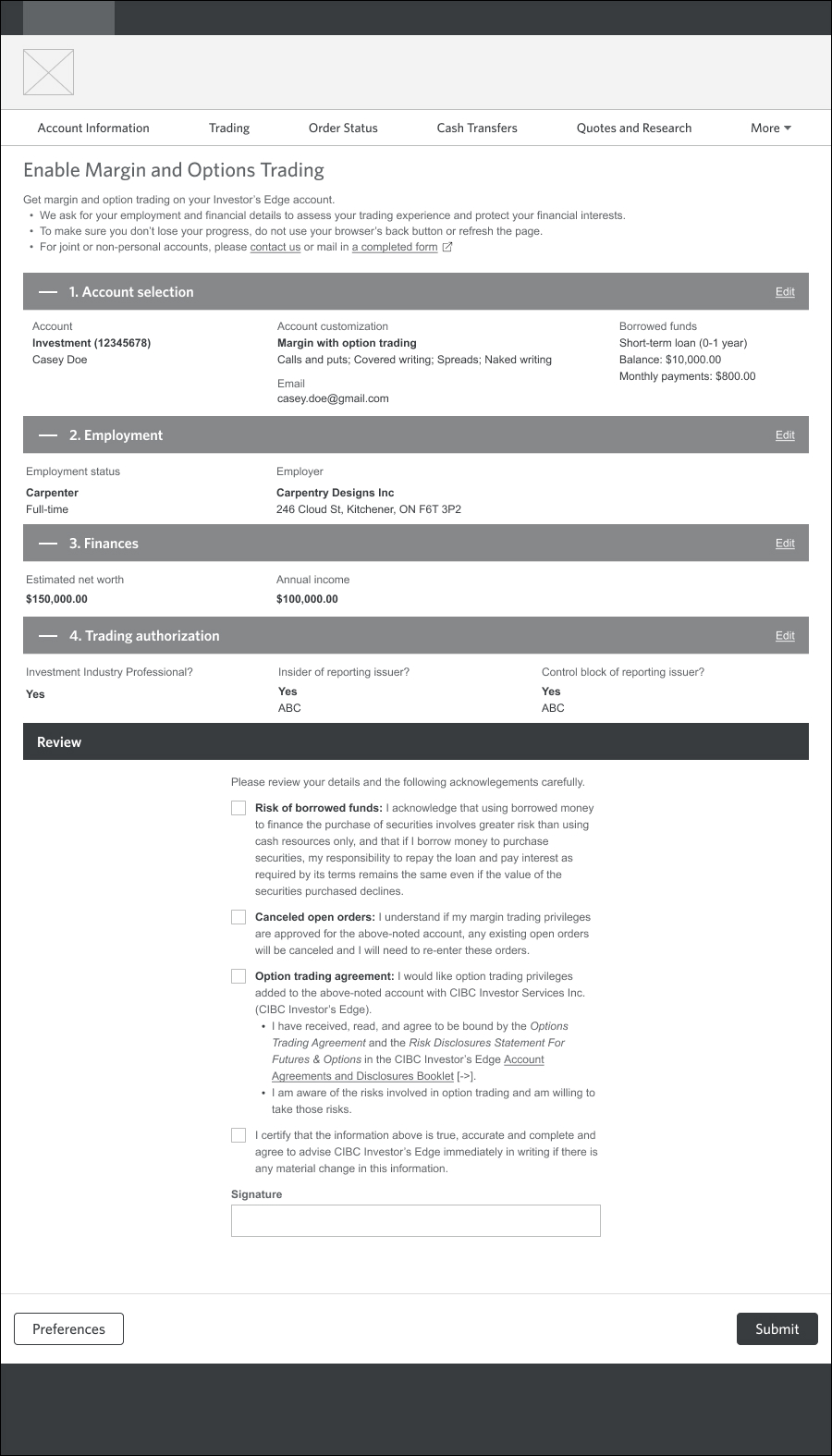
(e) Review
More legalese to work through.
Standalone form
While my primary focus was the webform, I also collaborated with the Forms Management team to design a standalone paper form. We needed to pull out key sections, align it with brand standards, and ensure consistency with its online counterpart, since it would be autofilled by the webform to serve as a digital copy.
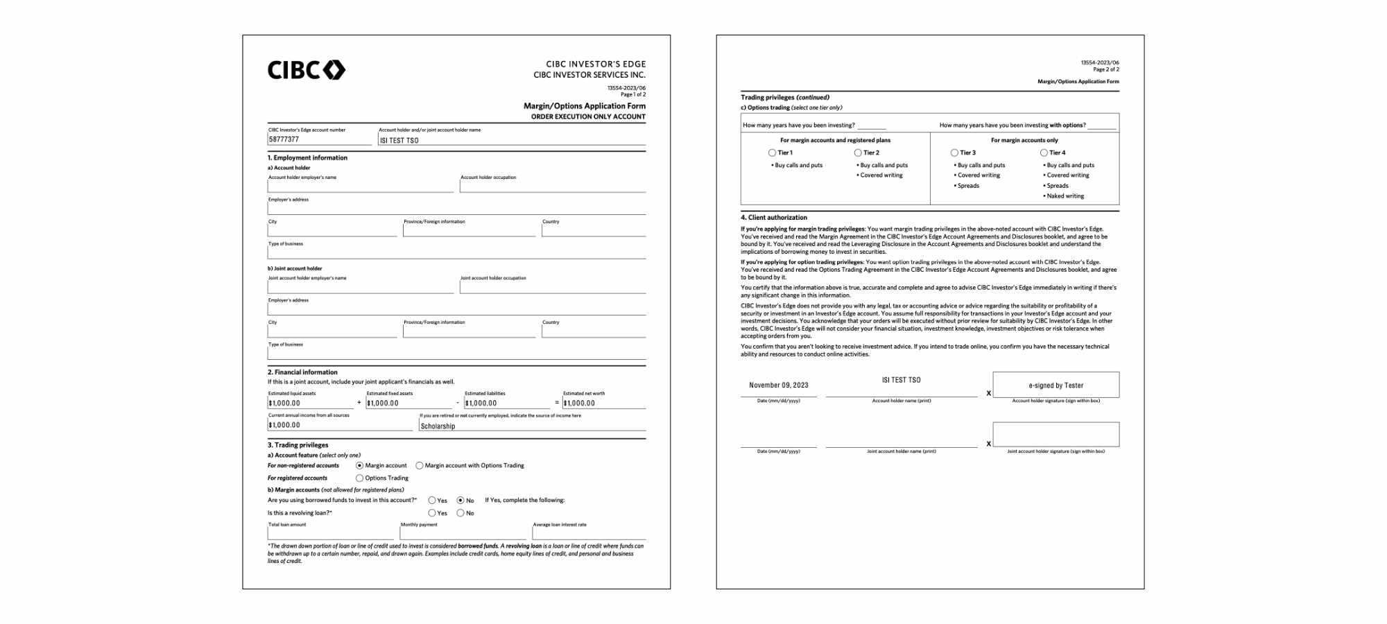
Throughout the project, this had cascading effects on the webform and vice versa, especially with copy. If a piece of content was modified on one form, I made the corresponding change on the other. Designing for PDF spacing and flow and seeing how it translated to the digital space was also an interesting challenge.
IV. User testing
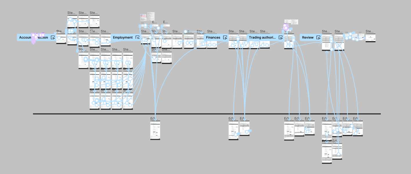
After a feasibility check with our developers, I built out a Figma prototype (mid-fidelity visuals, high-fidelity interaction). This was a tricky piece to build accurately; while it wasn't the longest form, making sure every interaction made logical sense was quite a feat (and Figma hadn't launched their conditionals yet!). I was also able to create a reasonable imitation of text input for a more natural form-filling experience.
Insights
In an unmoderated usability test, we recruited 15 self-directed investors familiar with options to go through each section of the form and test the edit flow.
gavel Trading privileges
- Educational support: Users liked seeing the risk level; about half read help text
- Experienced users: found the selection clear; noted it'd be more difficult for beginner options traders
- Newer users: noted help tips but hesitant to keep going without more information
Provide more support for options education. Clarify each tier.
work Employment
- Highest ease of use: users appreciated having their address auto-filled
- Main hurdle: selecting the right business field
- Free input: a few requested an “Other” option to provide their own answer
Leave as is.
savings Finances
- Help at the right moment: most read and appreciated the dynamic help text
- Unfamiliar terms: a few users stumbled on the scope of “Liquid assets”, but the section was intuitive overall
Clarify terminology.
signature Trading disclosures
- Knowledge gap: less experienced investors were unsure how to answer these questions but found the tooltips helpful
- Overlap: two questions felt redundant; while users understood they differed, they couldn’t articulate the exact difference
Simplify legal jargon for less experienced investors. Remove all unnecessary content.
draw Edit flow
- Findable: users easily found the Edit links for each section
- Continuous editing: A third edited sections one after the other without saving the current section first
- Clarity of status: After editing a section, a few tried to submit the form without finishing incomplete sections
Ensure that editing includes implicit saving. Clarify completion status of each section.
beenhere Submit
- Two-factor authorization: Though users were unaware they'd go through this process before starting, they were used to it and liked the extra security.
- Immediate feedback: A few expected a confirmation email or way to track their application status, but the overall process was clear
- Next best action: A third appreciated the links for further learning.
(Future state) Provide users with real-time application status.
Overall happy with the results, I fine-tuned the edit behaviour, put in some smarter defaults, and wrangled the content with our Editorial and Legal teams. After a few more rounds of stakeholder approvals, I wrote up the interaction specifications and sent it off to the developers.
V. Deliverables
Finally pulled off the backlog, the margin & options form was slated for development. There were slight hiccups, like the development team accidentally using the wireframes as visual guidelines and a rotating project team (taking well-deserved summer vacations!).
Despite these frustrations, this period of QA testing was a golden opportunity to really make the interactions shine and make sure everything was up to the design team's standards. And it paid off! After nearly two years of hard work and to our great relief, we finally launched this page in October 2023.
The technology team praised us for a job well-done; despite being the most complex project in the release, the Margin & Options Application (and the other options-related page) were the smoothest by far. In the first two weeks of soft launch, we saw a natural uptake of 31%, an excellent achievement considering the lack of marketing.
Over two years (Oct 2023 - Oct 2025), completion rates increased to 41% and on average, converted over 200 new options traders every month. This project was an amazing win for bringing in more trading commissions for the business, reducing back office approval times, establishing form design patterns, and building investors' financial independence.
VI. Takeaways
map From design to development
Overseeing the end-to-end process from research to design to development gave me a deep understanding of the realities of the role designers play within an organization. It's simple to specify an input field "must take numbers only" in your wireframes, but so many ways it can go sideways in production (scientific notation and formatting and decimal points, oh my).
running_with_errors The perils of unmoderated testing
Pilot tests are underrated for bullet-proofing unmoderated usability tests. It was eye-opening to see all the ways users could trip on instructions or end up in the wrong areas of the prototype by accident. Learning how to be as clear & concise as possible and ironing out prototype gaps was finicky but completely worth it for getting quality data.
library_add_check UX = hiding your work as much as possible
In every product, there is an extraordinary amount of effort and a million tiny decisions by an army of people that goes into ensuring a consistent and smooth experience. People say that good UX is invisible, and it truly is an iceberg.