ICMonstar
Overview
ICMonstar is a local cafe specializing in Thai rolled ice cream and other delightful delicacies. It struggles to attract college-aged customers, despite its strategic locations and unique drink and dessert offerings.
We redesigned the information architecture and rebranded ICMonstar's website. We ended up with fully interactive mobile and desktop prototypes and made modifications to the existing website.
work UX/UI Designer, Front-End Developer
date_range Jan - Mar 2019
groups Gendarme Docena, Lam Pham, Jiayi (Nancy) Zheng
construction InVision, Affinity Designer, Node.js
Deliverables keyboard_arrow_down
I. Understanding the Client
We met with Jenna Hu, a co-founder of ICMonstar, to discuss the cafe's current issues and her vision for its future.
The Competition
Both locations are surrounded by several shops with similar menus. ICMonstar stuggles to differentiate its own identity and unique offerings. Meanwhile, Jenna is limited on time and money.
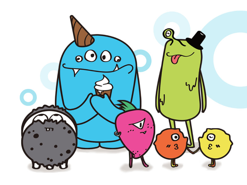
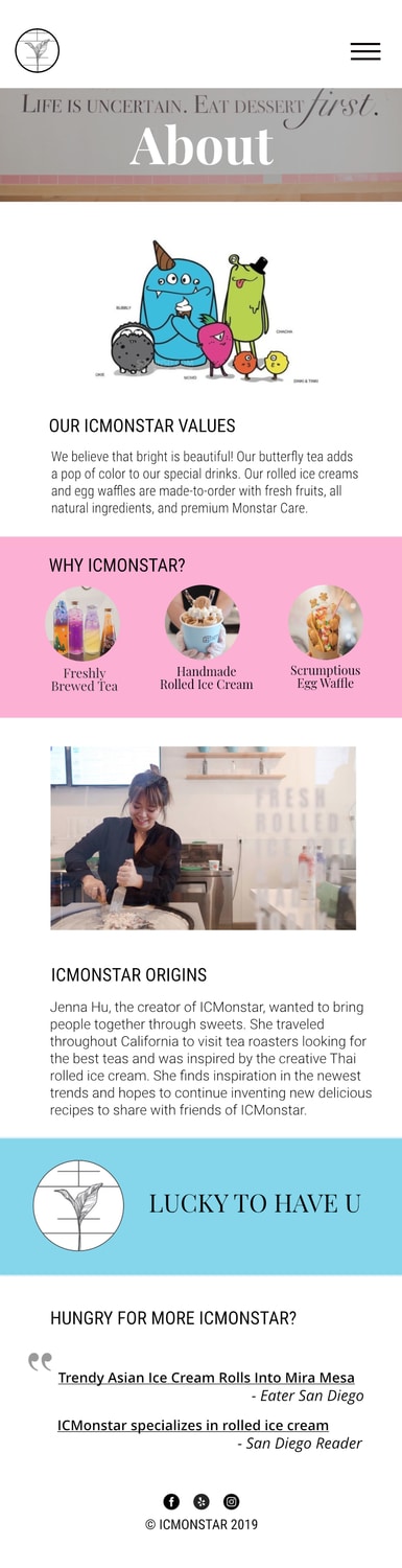
The Mascots
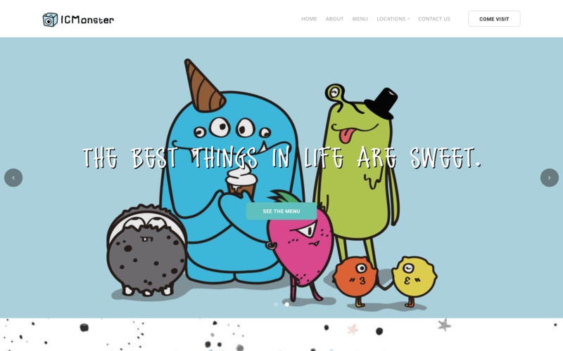
ICMonstar's monster mascots are a crowd favorite, especially with families and younger children. This is reflected in the aesthetic of ICMonstar's drinks, desserts, interior, and website.
The Rebrand
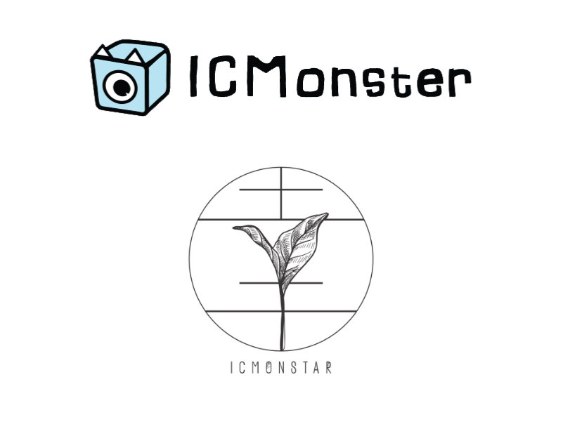
ICMonstar had recently rebranded to appeal to the nightlife crowd. Their new logo was a minimalistic tea leaf modeled after the Chinese character for "luck", inspired by their slogan "Lucky to have you".
II. Understanding the User
We conducted interviews with 12 users (customers, potential customers, and employees) to learn about ICMonstar's current reputation.
- First impression: "Cute"
- Typical behavior: (1) purchase rolled ice cream, (2) find seating, (3) socialize
- Greater appeal to females
- Different demographics at each location (families vs teenagers)
From these, we found our users centered around three key features: savings, aesthetics, and service.

Theodora the Deal Hunter
While she's enjoying family night, Theodora keeps an eye out for discounts and deals. She doesn't mind trying new things, especially with her finicky kids, but wants to get the best bang for her buck.

Janet the Aesthetics Admirer
As a socialite, Janet values looks over anything else in a dessert shop, with an eye for well-designed decor, a clean environment, and beautiful and unique drinks.

Bob the Hospitality Hound
Bob's in charge of getting lunch for the office, so he needs to get back fast with delicious goodies. He wants to know what ICMonstar offers at a glance and order without hassle.
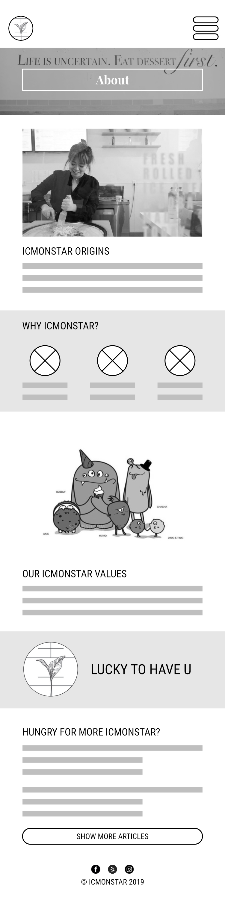
III. Understanding the Website
ICMonstar's original site is extremely family-friendly, showcasing its mascots and bright colors. However, there's a lack of focus on the cafe's desserts and drinks. Some navigation menu items were redundant and the food menu had several usability issues, such as an abundance of scrolling and lack of pricing.
The Goal
Reflect ICMonstar's more sophisticated personality while keeping true to its monster roots.
Competitive Analysis
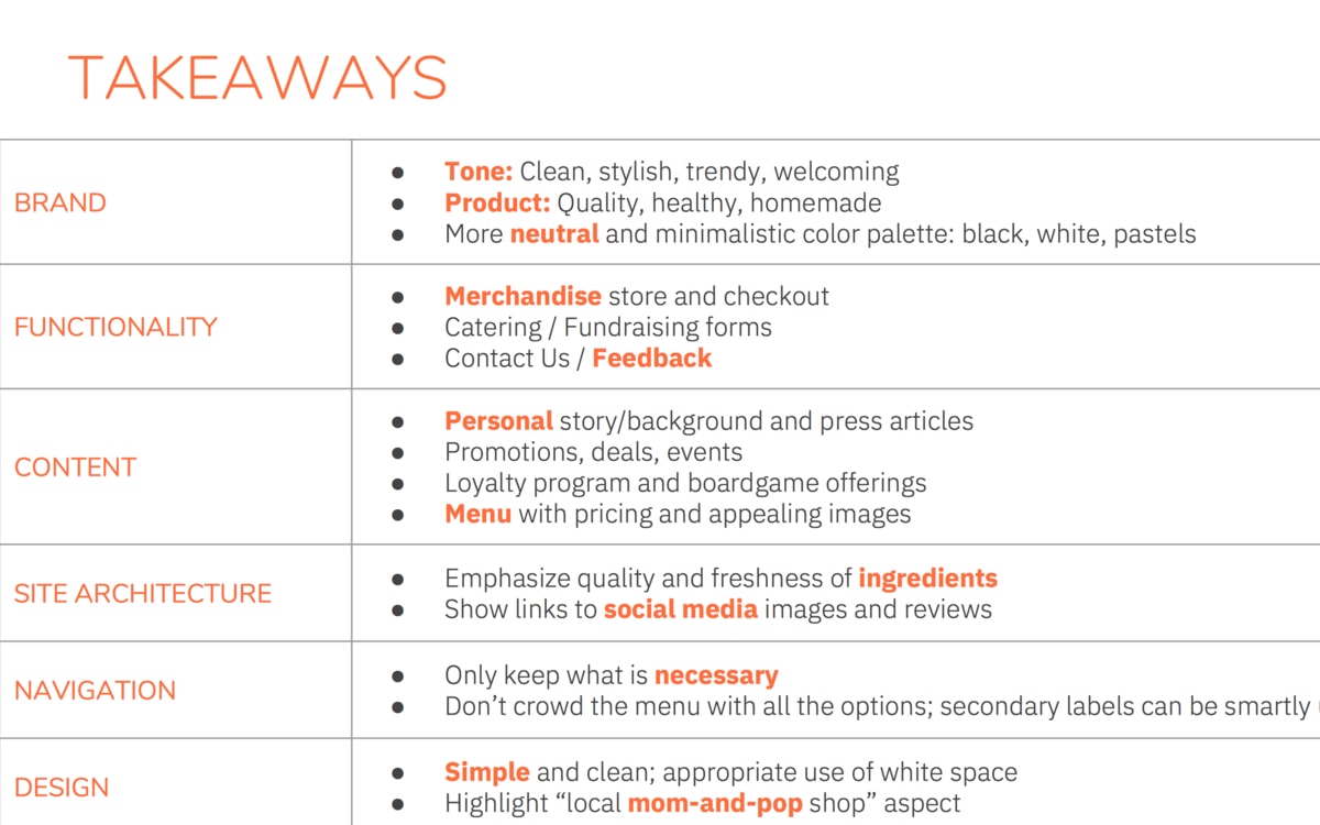
We performed a competitive analysis on websites with similar drink and dessert offerings, looking at what worked and what didn't for branding, functionality, content, site architecture, navigation, and overall design.
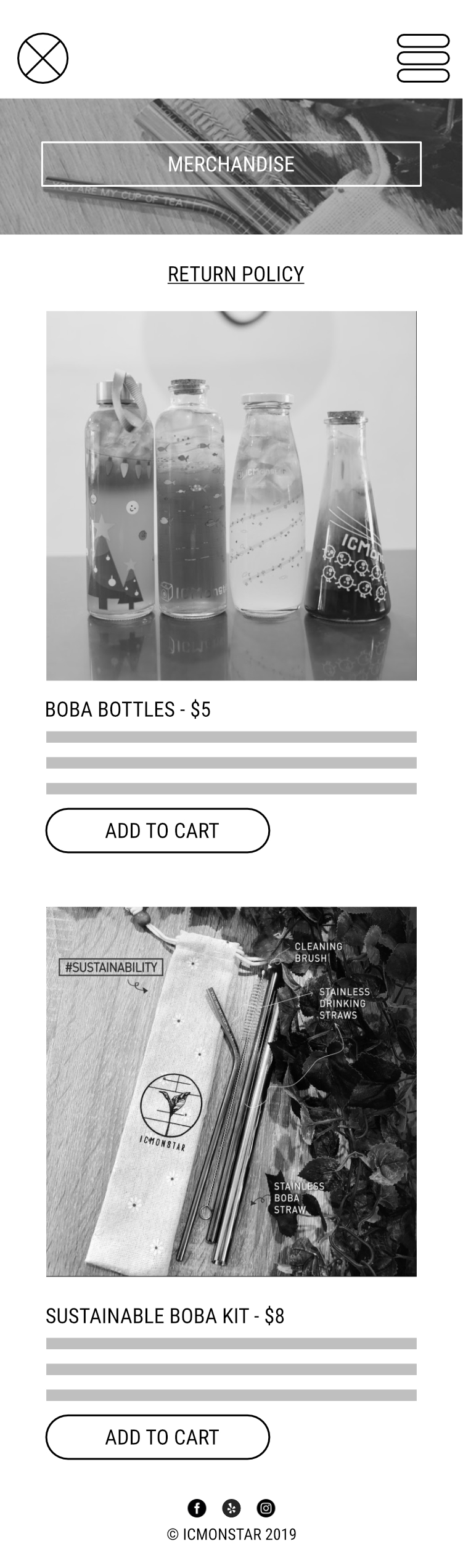
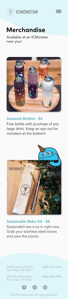
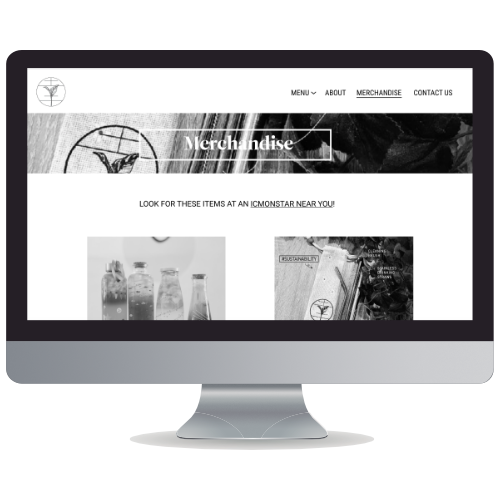
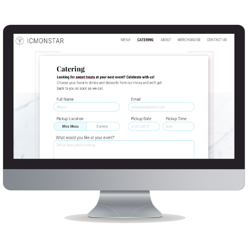
- Merchandise and Catering pages
- Emphasis on quality, freshness, and ICMonstar's story
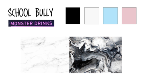
Moodboards
We also compiled moodboards to visualize ICMonstar's goal for a more mature clientele. This helped us focus on key items and ideal aspects for ICMonstar's site.
- Clean, stylish, trendy, welcoming
- Minimalist pastel color palette
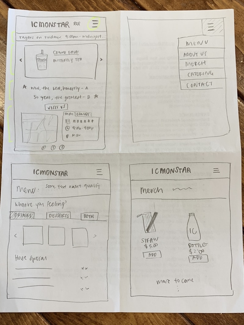
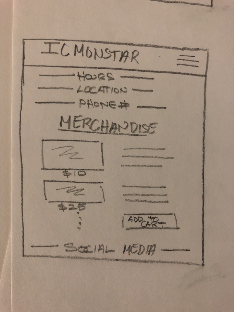
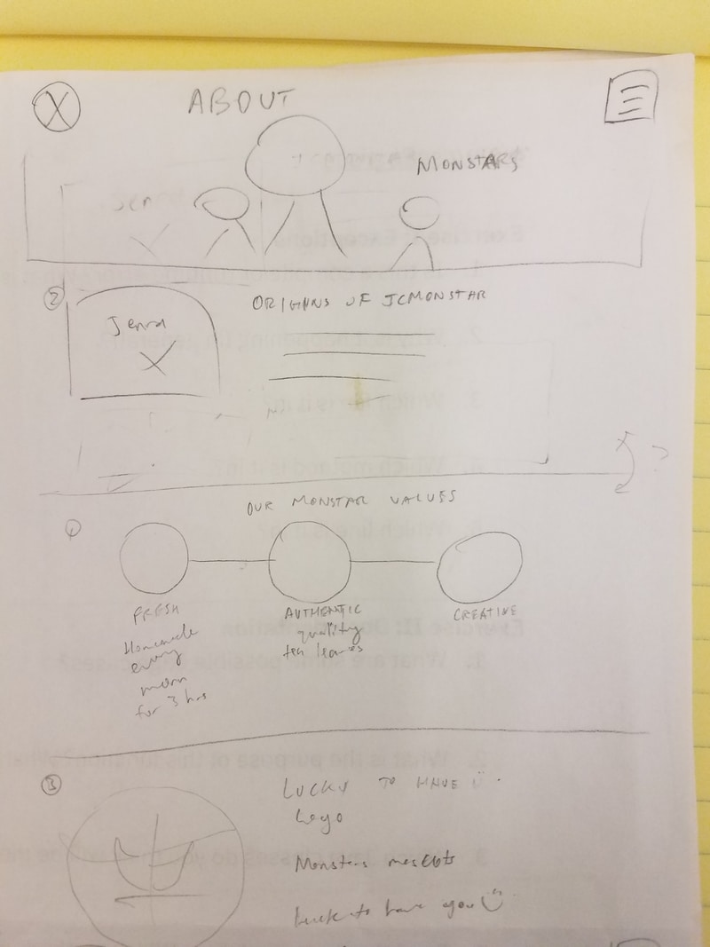
IV. Sketching
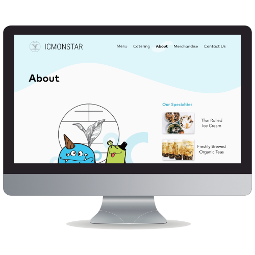
For the redesign, we revamped the information architecture, removing Home, Locations, and Come Visit from the navigation bar and replaced them with Merchandise and Catering. This was to avoid redundancy and satisfy both Bob's needs and ICMonstar's wishlist. The Homepage would contain promotions and social media links and images.
We settled on 6 main pages for the website: Homepage, Menu, Merchandise, About, Catering, and Contact. We then sketched them individually to generate more ideas about possible implementations.
V. Wireframing
After consolidating our sketches and deciding on the bare-bones structure of each page, we started building in features desired by the client and Janet the Aesthetic Admirer's needs, like high-quality images, social media links, and a more mature design scheme.
User Testing
However, once we got the wireframes into the hands of our users, our testing revealed gaps between the user's mental model and our conceptual model.
- Scrolling was not obvious
- Menu toggle obscured by page fold
- "Image galleries are the first thing I would look at"
VI. Prototype I
Though we had a rough idea of what we wanted, the most difficult part was designing in tandem without a style guide. However, we were able to focus on function and refine the copy, colors, images, and use of monster mascots.
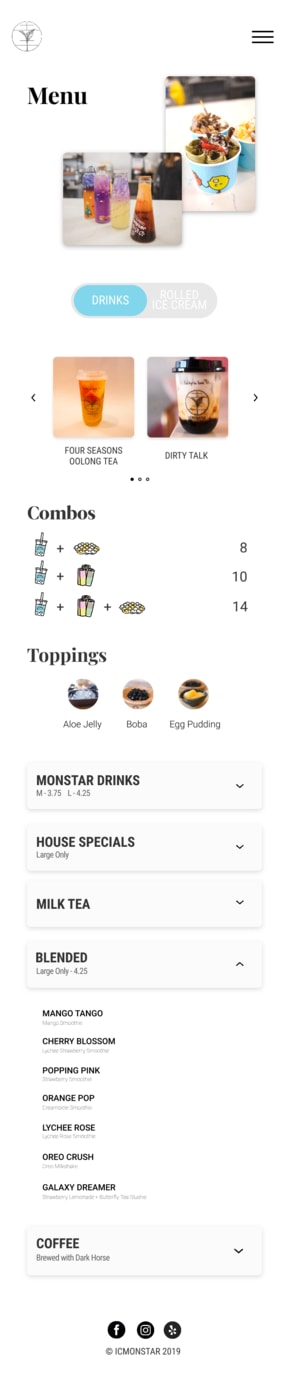
What's wrong with the menu?
Every restaurant and cafe's top priority is (or should be) the menu, and ICMonstar was no different. The original menu was a long list of drinks with an extreme case of whitespace, resulting in scroll exhaustion. Additionally, drink categories, prices, and ingredients were unclear and inconsistent (e.g. how is a Monster Drink different than a Classic Drink?).
After carefully analyzing the menu, we categorized drinks by specials and types of drinks. For mobile screens, we condensed the list with accordions to reduce the amount of scrolling. These folders were also labeled with clear headings and subtitles to show available options at first glance.
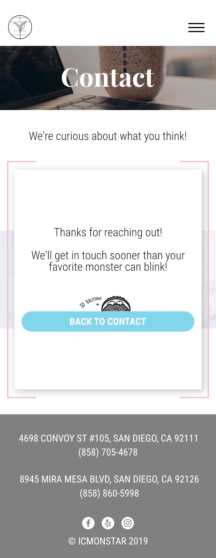
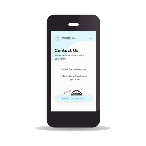
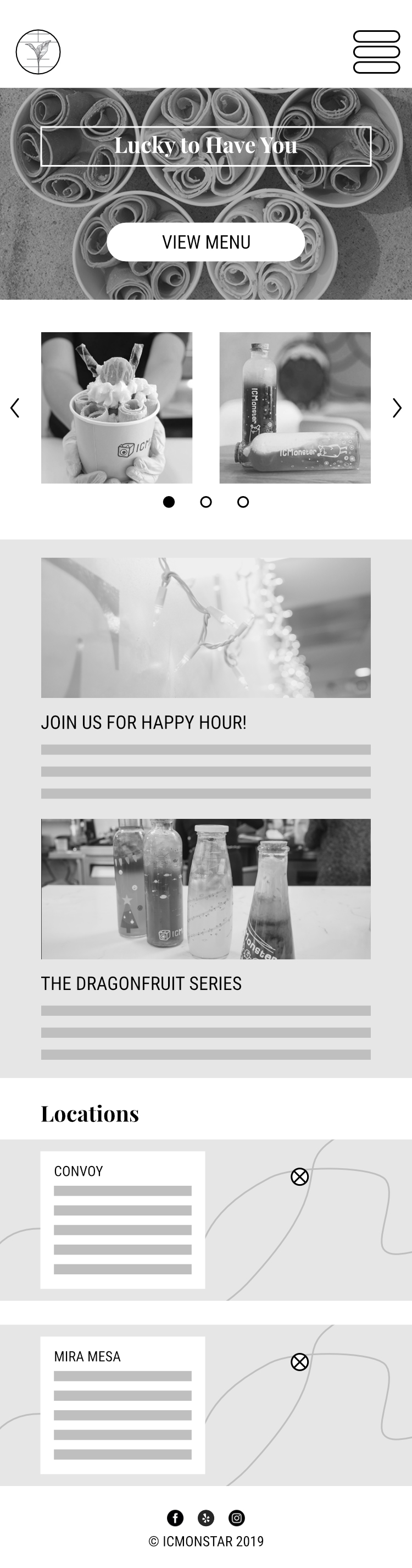
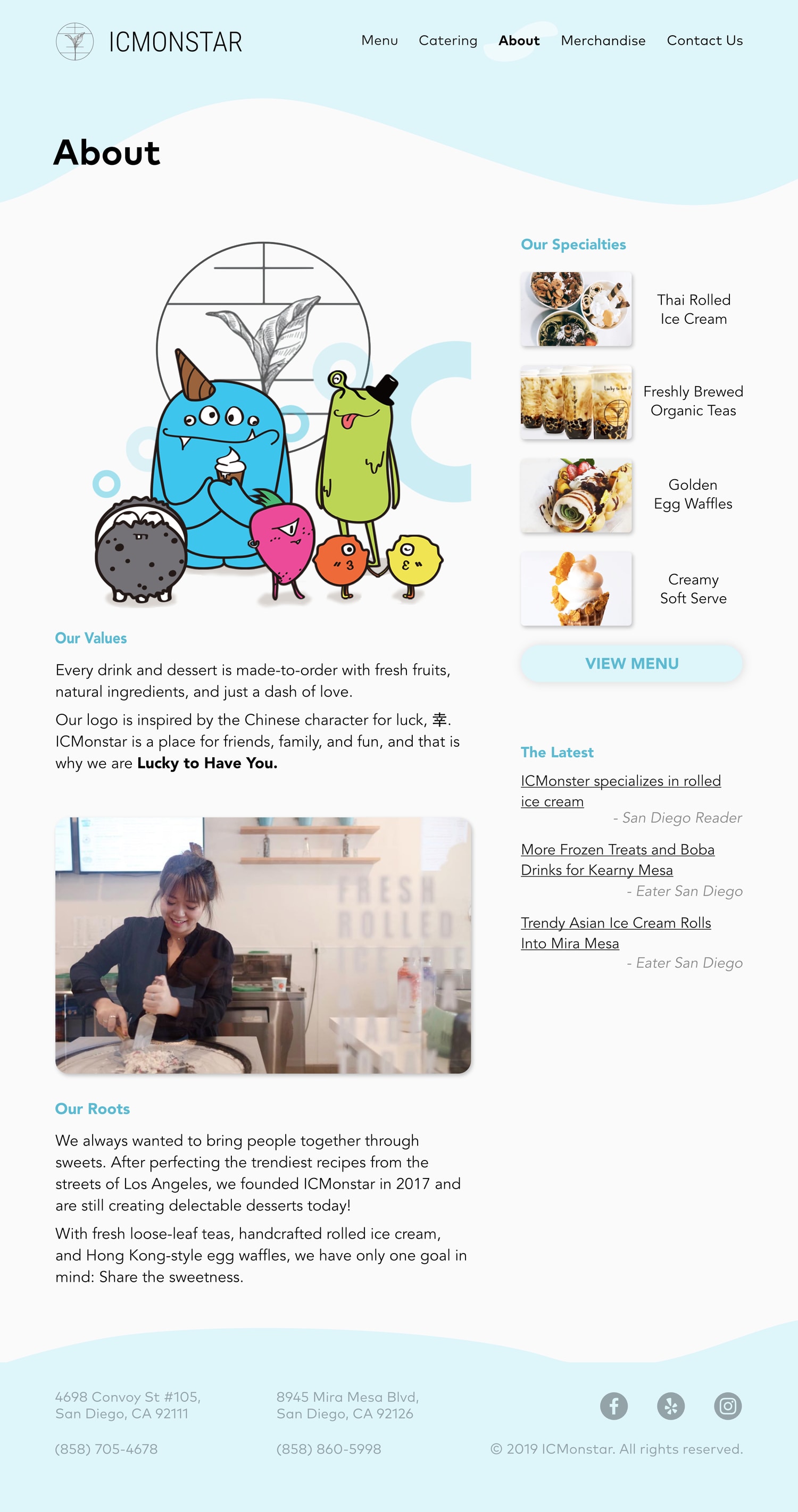
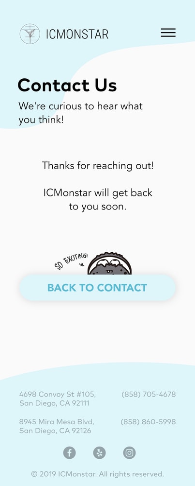
VII. Final Prototype
After another round of user-testing, we overhauled the entire branding to be warmer and more welcoming with rounded corners to the buttons, font, and other elements. To stick true to ICMonstar's roots, we integrated its monster mascots in corners of the site and used a unified pastel blue palette.
Defining and following a style guide made our prototype more cohesive, especially since each of us worked on separate pages.
Conclusion
Contributions
- Kept team on track throughout project
- Wrote copy for all pages
- Wireframed mobile version
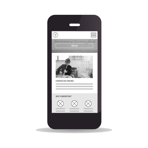
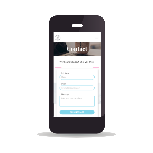
- Prototyped Catering, Merchandise, About, and Contact pages
- Modified live version of site
Takeaways
- Getting someone to share their time with you is difficult!
- Easy to reach out, hard to hear back.
- Staying transparent about what you need is crucial.
- Copy plays a huge role in branding.
Deliverables
Wireframes
Prototype I
Prototype II